
It looks decent in that mock up. You all wear bootcuts anyway. Tom Cato knows feck all.
Is this next season's home kit for United?
- Thread starter padzilla
- Start date
Phil Osophy
Full Member
- Joined
- May 7, 2015
- Messages
- 881
Total garbage if true. Simply awful.
pacifictheme
Full Member
- Joined
- Sep 28, 2013
- Messages
- 7,728
It does amaze me that despite having such a simple home kit we have managed to feck it up so much in recent years.
And I do not wear boot cut jeans.
And I do not wear boot cut jeans.
Snafu17
Full Member
- Joined
- Feb 11, 2014
- Messages
- 1,869
Hopefully they'll just the a line of that pattern through the middle or something and not spam it all around the kit like in that fan render. I don't know why they insist to experiment so much with our kits. The dazzle camo thing for out 3rd kit also sounds horrible Just make them simple. I blame streetwear.
Green_Red
New Member
- Joined
- May 29, 2013
- Messages
- 10,296
The only thing that would make that jersey look good is a bonfire.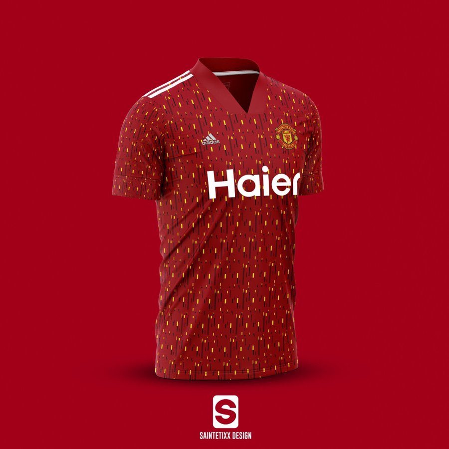
This is doing the rounds on Twitter atm. Presumably based on the footyheadlines article but it could've been what they based their article on.
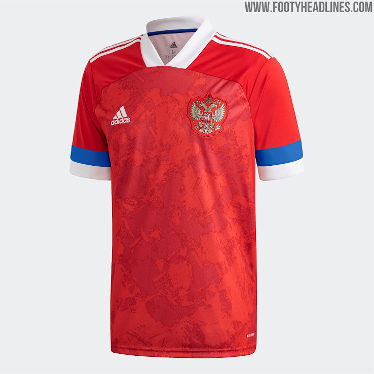
Now looking at the template for Russia/Belgium etc I wonder if the sleeves to bottom of the V-neck will just be red. You can see how the sleeve wraps over better on the Russia shirt but there's that definite split where the main shirt texture doesn't carry on.
Also never heard of Haier but apparently they're rumoured to be our new sponsor. Also the above doesn't have Kohler on the sleeve.
Doesn't look great, certainly doesn't look like a United shirt but we'll see.

I think the mock up is class, personally.
If the leaks are anything to go by, then all 3 kits next season are going to be bad
matherto
ask me about our 50% off sale!
I really like the colourscheme for the away tbh. Think it'll look great.If the leaks are anything to go by, then all 3 kits next season are going to be bad
RyRy11
Full Member
- Joined
- Jan 1, 2014
- Messages
- 1,596
Wont it still have the Chevy logo on the front? Put that Haier logo on all of our kits since 2014 and they'd all instantly be more memorable/loved.
Redplane
( . Y . ) planned for Christmas
Really hope the supposed leaks are wrong. Looks like one of those fkin 80s jumpsuits.
The only way I could see a pattern like that working is if the markings are larger/less dense and/or the yellow fades into the red so it's a detail that's only really noticeable up close.
The only way I could see a pattern like that working is if the markings are larger/less dense and/or the yellow fades into the red so it's a detail that's only really noticeable up close.
RedTiger
Half mast
I actually quite like it. Perhaps a bit of white around the sleeves but otherwise quite nice.
ClaytonBlackmoorLeftPeg
Full Member
- Joined
- May 22, 2017
- Messages
- 13,122
Red and yellow - looks like Liverpool, aren’t they their colours?
looks utterly horrendous.
I bough a short when I went to the FA Cup final a couple of years back, wouldn’t buy one now in case, definitely wouldn’t go anywhere near something that looks like this.
looks utterly horrendous.
I bough a short when I went to the FA Cup final a couple of years back, wouldn’t buy one now in case, definitely wouldn’t go anywhere near something that looks like this.
Nero
Full Member
- Joined
- Dec 23, 2008
- Messages
- 3,291
What's this Haier all about. Have I missed something?
DWelbz19
Correctly predicted Portugal to win Euro 2016
- Joined
- Oct 31, 2012
- Messages
- 34,022
It looks decent in that mock up. You all wear bootcuts anyway. Tom Cato knows feck all.

PeteManic
Full Member
- Joined
- Dec 22, 2012
- Messages
- 2,152
I think its more likely that the yellow details will only be top of the shirt or on the arms.
Those are just guesses anyway. United were pretty secretive about their shirt last year.
Those are just guesses anyway. United were pretty secretive about their shirt last year.
Rolaholic
Full Member
- Joined
- Aug 1, 2016
- Messages
- 11,163
Someone made a mockup based on the leaked pattern

Hope the final product is easier on the eyes since those look like a public bus seat cover...
Hope the final product is easier on the eyes since those look like a public bus seat cover...
Freak
Born a freak always a freak.
That is absolutely horrendousSomeone made a mockup based on the leaked pattern
Hope the final product is easier on the eyes since those look like a public bus seat cover...
ClaytonBlackmoorLeftPeg
Full Member
- Joined
- May 22, 2017
- Messages
- 13,122
bus seat cover is the perfect description of this monstrosity.Someone made a mockup based on the leaked pattern
Hope the final product is easier on the eyes since those look like a public bus seat cover...
Alabaster Codify7
New Member
I havent liked a home shirt of ours since I was a kid, just bland and barely anything changes from year to year like most home shirts. I'm always more interested to see the away and third. This looks hanging, though, if it's true.
matherto
ask me about our 50% off sale!
It depends on the template used as I illustrated with the original mock up posted from Twitter but I'd say for certain it's gonna have that pattern on it at least.
Best get used to it.
Best get used to it.
Redplane
( . Y . ) planned for Christmas
Ha. Kept trying to come up with what it reminded me of. Bus seat cover indeed.Someone made a mockup based on the leaked pattern
Hope the final product is easier on the eyes since those look like a public bus seat cover...
Look at our crest to be fairRed and yellow - looks like Liverpool, aren’t they their colours?
looks utterly horrendous.
I bough a short when I went to the FA Cup final a couple of years back, wouldn’t buy one now in case, definitely wouldn’t go anywhere near something that looks like this.
ClaytonBlackmoorLeftPeg
Full Member
- Joined
- May 22, 2017
- Messages
- 13,122
indeed. But I can’t remember a home kit that’s red and yellow. They are the colours synonymous with Liverpool.Look at our crest to be fair
GledTheRed
Full Member
I love it!Someone made a mockup based on the leaked pattern
Hope the final product is easier on the eyes since those look like a public bus seat cover...
Redplane
( . Y . ) planned for Christmas
You re right.indeed. But I can’t remember a home kit that’s red and yellow. They are the colours synonymous with Liverpool.
Much better than the first mockup IMO, I don’t mind it at all.I love it!
Devil may care
New Member
- Joined
- Jan 7, 2010
- Messages
- 35,976
Highly underrated post.

charlenefan
Far less insightful than the other Charley
- Joined
- Aug 17, 2005
- Messages
- 33,052
Usually a lot more leaks by this time of the year, strange that this one has managed to keep under wraps
Dr. Dwayne
Self proclaimed tagline king.
Easy. No season, no kits to leak.Usually a lot more leaks by this time of the year, strange that this one has managed to keep under wraps
Token Sheet
Full Member
Yellow is synonymous with Liverpool end of and should not be on a Utd home shirt.
Red Black and White it's as simple as that.
Red Black and White it's as simple as that.
Token Sheet
Full Member
Its supposed to be gold not yellow....Look at our crest to be fair
Lynty
Full Member
- Joined
- Oct 21, 2014
- Messages
- 3,094
I agree. Change the gold specs to white and it would look much better
Judge Red
Don't Call Me Douglas
- Joined
- Feb 11, 2006
- Messages
- 5,993
Hated the gingham and the chevron shirts, not a fan of gimmicky shirts I’m general, but the mock up above doesn’t look bad. That’s still too simple for a professional designer, though. They’ll find other ways to screw it up.
Devil81
Full Member
- Joined
- Aug 7, 2014
- Messages
- 6,680
Two worst kits I can remember, the red and black one from Lukaku's first season, hated it.
And that kit Owen scored the winner against City in.
Cant decide which was worse.
And that kit Owen scored the winner against City in.
Cant decide which was worse.
That’s just on this seasons jersey. Our actual crest is red and yellow. Has been for a long time.Its supposed to be gold not yellow....
The greenish grey and orange colour? Im not sure about how they could make that look good or even relate it to utd? And the 100's & 1000's or sprinkles design of the 3rd kit is badI really like the colourscheme for the away tbh. Think it'll look great.
matherto
ask me about our 50% off sale!
I don't think it'll relate much to United but it's a good colourscheme. The Predators/other Adidas boots in that greenish grey look really good.The greenish grey and orange colour? Im not sure about how they could make that look good or even relate it to utd? And the 100's & 1000's or sprinkles design of the 3rd kit is bad
sullydnl
Ross Kemp's caf ID
- Joined
- Sep 13, 2012
- Messages
- 34,063
Those mock ups are ugly as shit.
Yeah 100% the boots do look good i cant argue with that, but kits are a different story. I havent given up hope yet that they might surprise me but at the minute there isnt one thing that stands out for me (in a good way atleast) with any of the three kits. No way would i part with upwards of £60 for one eitherI don't think it'll relate much to United but it's a good colourscheme. The Predators/other Adidas boots in that greenish grey look really good.
padzilla
Hipster
- Joined
- Oct 31, 2005
- Messages
- 3,393
I always found it odd we've only ever had one yellow away shirt when it's one of only two colours on the club crest.