- Joined
- Dec 5, 2018
- Messages
- 701
It's terrible. It's even worse than the one that fades into black.

I quite liked that one, at least it worked as a full kit and looked different IMO.It's terrible. It's even worse than the one that fades into black.
 at least if you spill some ketchup and mustard down you nobody will notice.
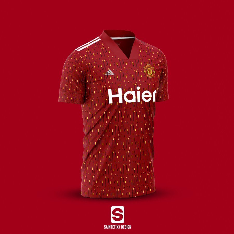
That's pretty gross.Someone made a mockup based on the leaked pattern

Hope the final product is easier on the eyes since those look like a public bus seat cover...

That's quite nice.
That's horrid.Someone made a mockup based on the leaked pattern

Hope the final product is easier on the eyes since those look like a public bus seat cover...
Green? Looks greyThat green and gold kit of Rashford is great. I would buy it
Someone tell me this is fake.
The little box with "share" written in it is green.Green and Gold. Hidden message. Triangles in Adidas logo.
That's not grey, it's green. Like a kind of sage green.The little box with "share" written in it is green.
This is some horrid grey
I think you might be a bit colour blind mate, no way is that grey!Green? Looks grey

That's pretty good.
That's not grey, it's green. Like a kind of sage green.
Maybe my screen and size of photo, looks a bit clearer enlarged. But it's definitely an odd colour. Not like the magic of that 93/94 kit.I think you might be a bit colour blind mate, no way is that grey!
I like it. Looks like an Australia top though.
Classic United shirt unveiling. Some think it's vile (like me) some people think it's great!That's pretty good.
I would buy that in an instant. Love those colours.
I didn't know Rashford is a South African rugby player
You get to a certain age and we all do. Oh, you mean the new kit!?Glazers will piss themselves laughing
I like that. Alot.
Yes I like it. Those colours are on point Bwoy!!

