Utd Kits 22/23
- Thread starter Carl
- Start date

choccy77
New Member
- Joined
- Jul 8, 2008
- Messages
- 6,059
This is the design I've seen with the new Sleeve Sponsors logo attached90’s
calodo2003
Flaming Full Member
Who’s our new sleeve sponsor?This is the design I've seen with the new Sleeve Sponsors logo attached
Big Ben Foster
Correctly predicted Portugal to win Euro 2016
This is a fan design, not the actual shirt
Red the Bear
Something less generic
- Joined
- Aug 26, 2021
- Messages
- 9,127
I like it actually, as much as people seem to dislike them, I absolutely adore the who psychedelic patterns we had on the shirts in the mid 90s, so much nostalgia infused with winning ways and gorgeous football.
Won't mind us going back to that, also collars are nice.
Edit : also I have a beef with addias's proprietary stripes, they put them on everything and it stops everything from having a simple clean design, and also it only looks natural on German teams aka bayern and their national team.
Won't mind us going back to that, also collars are nice.
Edit : also I have a beef with addias's proprietary stripes, they put them on everything and it stops everything from having a simple clean design, and also it only looks natural on German teams aka bayern and their national team.
Kopral Jono
Full Member
- Joined
- Oct 9, 2007
- Messages
- 3,416
Yeah, I don't know why but when it comes to football kits this forum seems to only have a hard-on for boring, unimaginative designs. Kits should always have playful elements to them, in my opinion, be it large patterns or small details like what we're seeing in this leak. We're not in the fifties any more where everything is handsewn and embroidered by hand.I like it actually, as much as people seem to dislike them, I absolutely adore the who psychedelic patterns we had on the shirts in the mid 90s, so much nostalgia infused with winning ways and gorgeous football.
Won't mind us going back to that, also collars are nice.
Edit : also I have a beef with addias's proprietary stripes, they put them on everything and it stops everything from having a simple clean design, and also it only looks natural on German teams aka bayern and their national team.
lex talionis
Full Member
- Joined
- Jul 25, 2017
- Messages
- 13,965
If this really is it, fukking hell.
SmashedHombre
Memberus Anonymous & Legendus
- Joined
- Mar 29, 2004
- Messages
- 31,851
I wonder if this is the worst thread on the entire internet, or just on the caf.
Mainoldo
New Member
- Joined
- Sep 17, 2004
- Messages
- 22,965
Ugly like our football. What happened to the unique designs instead of this grandad sh!te
- Joined
- Jan 7, 2018
- Messages
- 85
We are never going to get a decent kit under adidas are we?
PoTMS
Full Member
- Joined
- Dec 15, 2016
- Messages
- 16,391
What about if we put it in a shield? Any takers...

calodo2003
Flaming Full Member
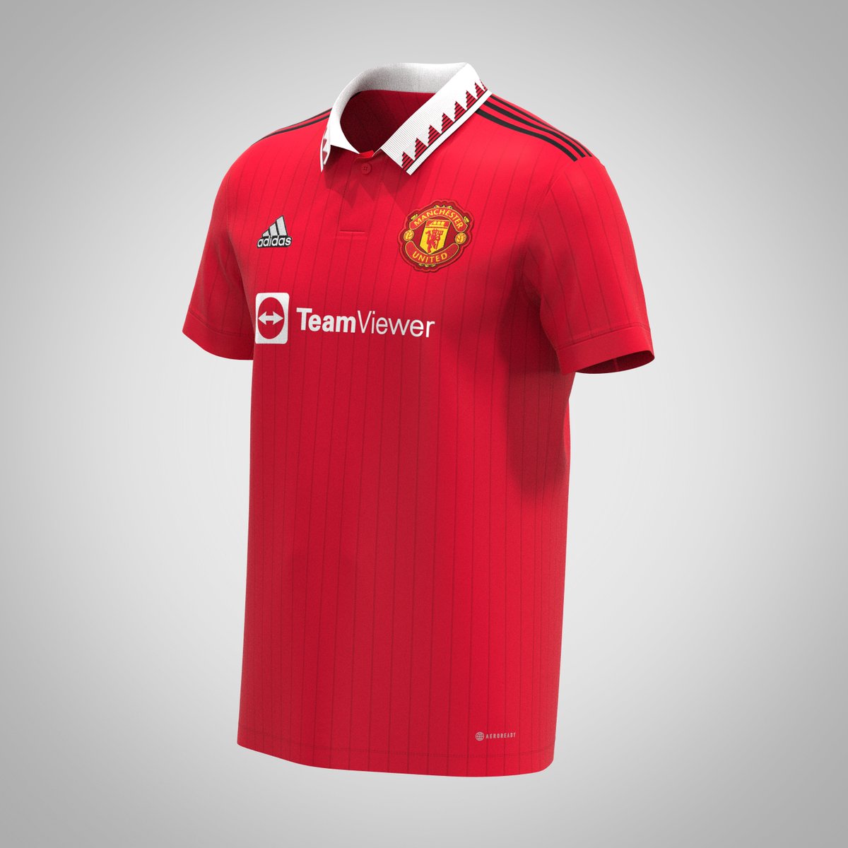
New Footy Headlines leak…
https://www.footyheadlines.com/2021/06/manchester-united-2022-2023-home-kit.html?m=1
https://www.footyheadlines.com/2021/06/manchester-united-2022-2023-home-kit.html?m=1
The triangle design is great. The shirt would be ruined by that weirdly basic shield though.
Plant0x84
Shame we’re aren’t more like Brighton
Yup love that, but agree about the shield. Looks cheap.
P-Nut
fan of well-known French footballer Fabinho
Definitely got a 90s feel to it
Jericholyte2
Full Member
- Joined
- Oct 6, 2004
- Messages
- 3,561
OH HELLO!
I love it!
I love it!
Red the Bear
Something less generic
- Joined
- Aug 26, 2021
- Messages
- 9,127
Not a fan of the shield, like at all but other than that it's a neat design.
MyBloodIsRed
Full Member
HATE the black shoulder stripes. Keep them white please.... will that mean they'll put black shorts with it like the terrible kit from 2018
Plant0x84
Shame we’re aren’t more like Brighton
Not necessarily.HATE the black shoulder stripes. Keep them white please.... will that mean they'll put black shorts with it like the terrible kit from 2018
TheReligion
Abusive
pure classWhat about if we put it in a shield? Any takers...
BluesJr
Owns the moral low ground
- Joined
- May 15, 2013
- Messages
- 9,052
Boomer design.
Todd
Full Member
Looks awful in my opinion. Doesn't look like a United home shirt.
Nice to know we'll look awful while also looking awful.
Nice to know we'll look awful while also looking awful.
The Red Thinker
Full Member
Looks awful in my opinion. Doesn't look like a United home shirt.
Nice to know we'll look awful while also looking awful.
 Kids these days don’t get it. We literally won everything with jerseys like these in the 90s.
Escobar
Shameless Musketeer
What is a 90s???
horsechoker
The Caf's Roy Keane.
That's a goalie kitTweet
— Twitter API (@user) date
Glorio
Full Member
- Joined
- Jun 16, 2020
- Messages
- 4,577
That's actually a nice shirt
Glorio
Full Member
- Joined
- Jun 16, 2020
- Messages
- 4,577
I wonder if there's a strong correlation between affinity to this shirt and age (>35) 
Mainoldo
New Member
- Joined
- Sep 17, 2004
- Messages
- 22,965
Yeah Grandad designs for the over 35. Hopefully our kit designers realise it’s 2022.I wonder if there's a strong correlation between affinity to this shirt and age (>35)
Hoof the ball
Full Member
There's no way it's skin-fitted. Shaw wouldn't have that.Tweet
— Twitter API (@user) date
There's not. Retro shirts have been in fashion for ages. As have vintage clothes.I wonder if there's a strong correlation between affinity to this shirt and age (>35)
DWelbz19
Correctly predicted Portugal to win Euro 2016
- Joined
- Oct 31, 2012
- Messages
- 34,020
I think I saw Arsenal might have a collar this season too so it must be an adidas thing
Frank Grimes
Full Member
This will be pretty much the design but this photo looks cheap as feck. The sponsor looks too large fo a start. That's a bad DH gate knock off if ever I saw one. The real one will look much slicker.Tweet
— Twitter API (@user) date
Dr. Dwayne
Self proclaimed tagline king.
Not here. Adidas continues their tradition of not living up to expectations with out kits and releasing pure shit.I wonder if there's a strong correlation between affinity to this shirt and age (>35)
AaronRedDevil
Full Member
- Joined
- Jun 28, 2018
- Messages
- 9,567
It’s nice, but I Always hate when it’s so plain looking on the overall jersey. I prefer when there’s a pattern on it. Not like the fecking Tableclot but something the break up the long stretch of red on it. Like the 09/10 Jersey with the V on the front.