Welcome to the new XenForo 2 site

acnumber9

Full Member
Joined
Jun 21, 2006
Messages
22,290
I haven’t read through the whole thread to see if this has been mentioned but is it not optimised for using on a smart phone? I have to hold my phone landscape to get to the most recent post which is a little awkward.
 

Solius

¯\_(ツ)_/¯
Staff
Joined
Dec 31, 2007
Messages
86,442


@Niall threads seem to be spaced a bit weird. Some have gaps and others don’t. Also there’s no option to click on the last page from this menu like before.
 

MackRobinson

New Member
Joined
Dec 30, 2017
Messages
5,134
Location
Terminal D
Supports
Football

prateik

Full Member
Joined
Dec 14, 2005
Messages
42,175
This looks cleaner and newer... But I have a lot of things to get used to .

No longer see the New Posts button. At the top of the page on mobile. It's hidden away inside the hamburger menu..

No longer see page numbers below pages in search of under pages in the thread.. no quick jumping..
Other changes with fonts and boldness which i got used to and could easily spot things at a glance now need a lot more attention..

I'll get used to some of them pretty soon..
I'll always miss the new post button.
 

redshaw

Full Member
Joined
Jul 17, 2015
Messages
9,688
I prefer how the old version defaulted to latest posts for football whether you first visit, click on the home button or the redcafe logo at the top. It was good way to jump back or refresh the latest posts football related within a thread.

Now it's all jumbled up, every thread latest post on the forum is placed there so I see NBA, Tesla Trump as the first thing when I visit redcafe United football forum.

I've noticed when you log in you can click on football and it will stay on that and behave like the old version but this is no good for when not logged in.

Don't get me wrong, I visit the other sections.
 

Olly Gunnar Solskjær

Marxist bacon-hating kebab-dodging Tinder rascal
Scout
Joined
Jan 26, 2008
Messages
36,895
Location
dreams can't be buy
Clicking the new thread button on the index gives this error

Oops! We ran into some problems. Please try again later. More error details may be in the browser console.
 

Martial

Full Member
Joined
Nov 4, 2015
Messages
543
@Niall I'm not sure if it's possible, but the Report text being right below each forum post on the left-hand side is quite distracting while reading posts. If it could be moved to anywhere on the right-hand side that would be fantastic.

Also the grey line just above each Report/Quote/Reply seems unnecessary and just gets in the way.

Thanks for the great work!
 
Last edited:

thejtrain

Full Member
Joined
Aug 25, 2013
Messages
1,894
Location
Cary, NC
Looks stunning on my mobile. I did the miss the simplicity of v1, but that was for about 5 minutes. I really like the new design, especially on the mobile. Cheers, all!
 

The Don

Metrosexual Candy Shagger
Joined
Jun 18, 2011
Messages
12,908
Location
Dayman, ahhhahhhahh, fighter of the nightman
@Niall I'm loving the floating 'up to top' and 'down to bottom' arrows. For people, like me, who mostly browse the site on PC, this is a godsend. It may not seem like much but it's just a really handy feature. I did request this ages ago but I'm glad to see it part of the new update. The whole thing is pretty classy, tbf. Good job!
 

Dante

Average bang
Joined
Oct 22, 2010
Messages
25,280
Location
My wit's end
Ok I've flipped the colours so it's more like the old design - light background with darker content blocks instead of dark background with lighter content. Put back in the red border around posts also and I think it does look better. Thoughts?

Whenever I veer away from the classic design / colours it always seems to be a mistake :)

Lots more to do but this is a start.
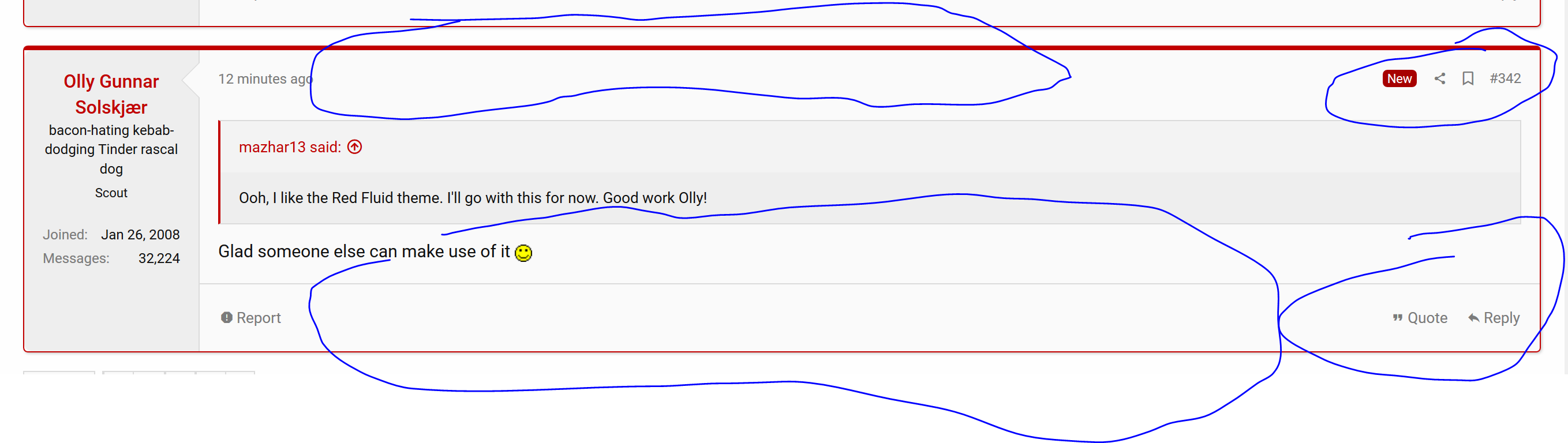
The Matchday Forum is still white on red.
 

Isotope

Ten Years a Cafite
Joined
Mar 6, 2012
Messages
23,618
  • The space between post could be tighten up a bit.
  • And agreed with the suggestion that if possible, to move Report, Edit, Quote, and Reply to upper part, to be in line with New, Share, etc.

Otherwise, feels like this new one run faster in Chrome than the older one.
 

mazhar13

Kermit Inc. 2022
Scout
Joined
Sep 10, 2013
Messages
36,735
Location
Toronto, ON, Canada
This looks stellar. Great work @Niall !

The only problem is that there's too much white. Too bad the current dark themes on Userstyles don't work for now. I may have to come up with something myself.
 

amolbhatia50k

Sneaky bum time - Vaccination status: dozed off
Joined
Nov 8, 2002
Messages
95,662
Location
india
Have to say the speed on mobile devices is improved. The typing itself was slow and laggy on the old version. So far it's really swift now. Expects me to post even more you unfortunate souls
 

Olly Gunnar Solskjær

Marxist bacon-hating kebab-dodging Tinder rascal
Scout
Joined
Jan 26, 2008
Messages
36,895
Location
dreams can't be buy
Just noticed that there's a "Toggle Width" button down on the left near the bottom (in the red bar part of the footer), which might be handy for anyone on a wide monitor that doesn't want to resize their window.

Edit: Oh it doesn't remember the setting, you have to do it every time you load a page.
 

Dante

Average bang
Joined
Oct 22, 2010
Messages
25,280
Location
My wit's end
Here's a random post from 2008:


See how clean it is?

Now compare it with XenForo2:


There's too much empty space at the top and bottom of the post.

Also, the top and bottom right hand corners have too much going on. Can they be reduced into a dropdown or a set of icons?
 

ayushreddevil9

Foootball hinders the adrenaline of transfers.
Joined
Jul 11, 2015
Messages
10,277
I liked how previously whenever i opened redcafe, it took me straight to Manchester United forum. Now i have to manually go there first. Is there a setting to do this?
 

Isotope

Ten Years a Cafite
Joined
Mar 6, 2012
Messages
23,618
I like that three prongs symbol though. Look modern, with commercial potential. The "R" look like dragon tail, asian-pagoda style. Love it.

I also love the red color type. It's calm and classy.
 

Freak

Born a freak always a freak.
Joined
May 8, 2004
Messages
23,011
Location
Somewhere in your mind, touching a nerve
On a full desktop it looks and functions really nicely.

On a mobile it's annoying because:
  • you get a huge ad in the middle of the page and then another at the end of the page.
  • You can't select particular pages of a thread you want to go through (you only see a next or previous arrow)
  • You cannot go to the next or previous page from the top of the thread - you have to scroll all the way to the bottom
  • The date/time when a post was made is difficult to see
 

red4ever 79

New Member
Joined
Aug 27, 2015
Messages
9,530
Location
Czech Republic
Anybody else having trouble to submit a lineup prediction? I have selected my starting XI and subs, but when I submit it tells me "are you sure you want to choose no subs" @Damien is this your attempt to sabotage the chasing pack?
 

Massive Spanner

Give Mason Mount a chance!
Joined
Jul 2, 2014
Messages
28,131
Location
Tool shed
Damn... people will just find things to complain about
Well the site, on mobile at least, is much less functional and harsh on the eye than it was before. I see nothing wrong with people giving suggestions on how to improve that! Nobody is just complaining for the sake of it.
 

red4ever 79

New Member
Joined
Aug 27, 2015
Messages
9,530
Location
Czech Republic
Well the site, on mobile at least, is much less functional and harsh on the eye than it was before. I see nothing wrong with people giving suggestions on how to improve that! Nobody is just complaining for the sake of it.
Main issue on the mobile for me is you cant choose the page numbers. You have to click next or previous to move around.
 

Siorac

Full Member
Joined
Sep 1, 2010
Messages
23,815
Well the site, on mobile at least, is much less functional and harsh on the eye than it was before. I see nothing wrong with people giving suggestions on how to improve that! Nobody is just complaining for the sake of it.
Yes - on desktop it's fine but on mobile it has issues. The colour scheme works for me but not being able to select a specific page of a thread is quite annoying.
 

Class of 63

Sourness
Joined
Aug 15, 2017
Messages
9,028
Location
Going through the Desert on a Horse with no Name
Anybody else having trouble to submit a lineup prediction? I have selected my starting XI and subs, but when I submit it tells me "are you sure you want to choose no subs" @Damien is this your attempt to sabotage the chasing pack?
I can't even get to that stage without going round the houses, when I click on SUBMIT YOUR LINEUP PREDICTION it takes me to the Matchday thread which appears in the middle of the page with 3 inch margins on both sides.
 

Buchan

has whacked the hammer to Roswell
Joined
Jun 5, 2012
Messages
17,638
Location
The Republik of Mancunia | W3102
Great work, @Niall. Nobody likes putting a great deal of effort into something only for others who’ve contributed absolutely nothing to the process nit-pick and complain, but I guess if you look at it as being somewhat constructive, it’ll be a bit more palatable. :D

A query/suggestion, if I may? On the homepage or forum threads page, the subheading under each thread title includes the time and date of the last post but also the last poster to reply. I’m viewing on mobile so this sub-heading looks quite chunky with information as you’re scrolling/reading. Is it necessary to include the last poster to reply in this subheading? Have others viewing on mobile noticed this as well?
 

Niall

All Powerful Super Being
Staff
Joined
Jun 13, 1999
Messages
24,587
Yes there are a number of issues on mobile that I need to address, especially the navigation problems within threads. Also the style in general needs additional improvements. I've no problems with feedback, it's actually very helpful. It has been exactly the same every time we had a major change to the design.

I'm also seeing a bunch of flat out errors where the browser says the page won't load - anyone else seeing those?

I'll be working on all this in the coming days so hang tough.


I'm not sure if I'm Samuel L Jackon or the fat geek in that video. Probably both :)
 

Maciej

Known for "good moanings" not only in the morning
Joined
Feb 21, 2006
Messages
12,082
Location
Włocławek, Poland
I still think we'll get used to it eventually, but you really can't deny the fact it looks very rawkish.