Yagami
Good post resistant
- Joined
- Jan 27, 2013
- Messages
- 13,588
I don't either. It's two J's next to one another. Then again Nike is just a tick and adidas is just 3 parallels.I really don't see what's clever about it?
Each to their own I guess.

I don't either. It's two J's next to one another. Then again Nike is just a tick and adidas is just 3 parallels.I really don't see what's clever about it?
Each to their own I guess.
It's quite close to an old Fulham badge!It's almost as drastic as Fulham's badge change a few years back.

Ahh, didn't know that. I just remember the previous 2, which looked more like a coat of arms with swords etc.
Sickening.
That old Juve badge meant so much. So many Wednesday nights in the mid 90s were spent trying to overcome that badge.
The players they had. Ferrara, Di Livio, Del Piero, Conte, Pessotto, Deschamps, Davids, Zidane. What a team. What a struggle to overcome them. Then finally doing it in 99.
The old lady of Italian football has juncked her traditions for this photoshop looking garbage. Awful.
The MUFC stick man was used by the club since the sixties and possibly earlier. I think by the 90s they had started to phase it out entirely. Shame as I quite like it, although not as a club badge.Found it...
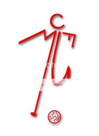
Seriously? I thought it was just an early 90's thing, I remember an amazing stick-man tracky I got for Christmas around 91-92, love it!The MUFC stick man was used by the club since the sixties and possibly earlier. I think by the 90s they had started to phase it out entirely. Shame as I quite like it, although not as a club badge.
Yeah, there is footage of the Old Trafford boardroom in the mid sixties and the stick man is used on the frosted glass doors. It was on official documents too.Seriously? I thought it was just an early 90's thing, I remember an amazing stick-man tracky I got for Christmas around 91-92, love it!
Although looking at is now, I think @SteveJ is right, looks more like a toilet sign.
Me either, I just looked up what you were on aboutAhh, didn't know that. I just remember the previous 2, which looked more like a coat of arms with swords etc.
City's was an abomination, it's just that it was the one you were used to. I grew up with City having a circular badge very similar to their new one, so it's easy to accept.Looks terrible. Their old crest was brilliant, as was Citys. God, I hope we don't go down this route.
I'd say it is no greater juxtaposition than having a name that translates as 'Youth' while being nicknamed 'the Old Lady', really.The juxtaposition of being called "The Old Lady" and having a trendy logo like this is hilarious. Like a regal old lady donning a shellsuit.


It's more than that.I don't either. It's two J's next to one another. Then again Nike is just a tick and adidas is just 3 parallels.

What's wrong with the Chevy logo?still ten times better than the new premier league logo or Chevrolet logo, the trend is still to simplify and flatten but perhaps the changes could be more sensitive, there's no link to the past, it's completely new thing, might not work well as a crest especialy on the stripes.. let's see the applications
Agnelli: 'this is a symbol of the Juventus way of living'

It took a year to create, no wonder Pogba left.
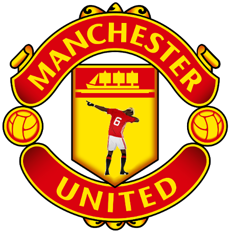
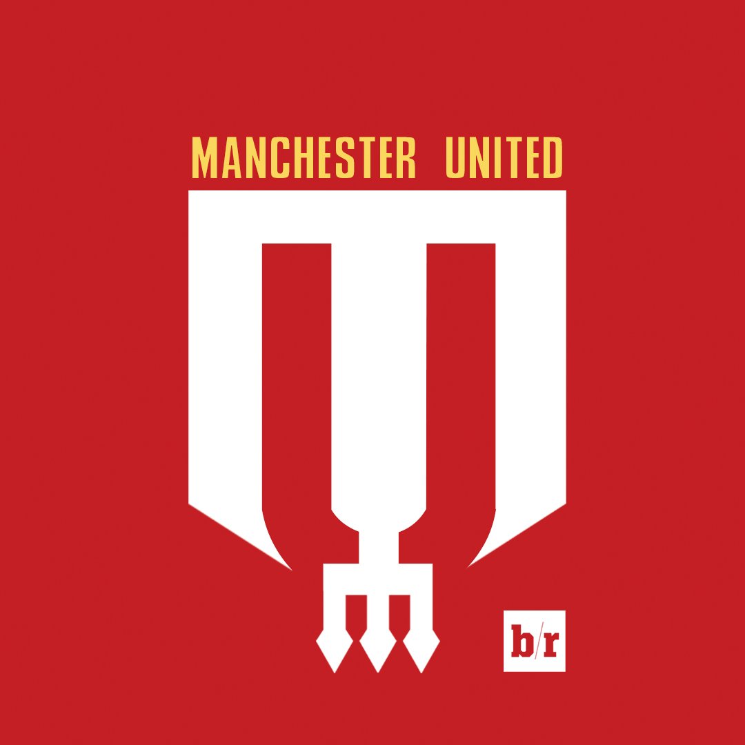
Just removed the United bit. Everyone knows us as Manchester anyway and then it's all pretty.
Tweet
— Twitter API (@user) date
Are you seriousWhat's wrong with the Chevy logo?
simply because it's ugly??What's wrong with the Chevy logo?
It wasn't on the shirts. They just had the Italian flag, right? But it was on everything else though.Must be your memory playing tricks on you, as Juve never even wore a badge on their shirts back then.

the fella had a stutterWhy are there two Js?
Juventus mean Youth, so I guess it is meant to mean "Youthful way of Living"'juventus way of living'? Wtf is that?
Don't mind the logo (though u prefer the old one) but I dislike stuff like that.
What makes the Chevy logo ugly?simply because it's ugly??
There isn't. The jay is the black middle.Why are there two Js?