99withaflake
Full Member
Do you mind if I print this out and shit on it?We need something modern and fashionable, to reflect the Caf's recently found love for pleasing-on-the-eye football above all else.


Do you mind if I print this out and shit on it?We need something modern and fashionable, to reflect the Caf's recently found love for pleasing-on-the-eye football above all else.
Sideways move, still extremely outdated. Footballs haven't looked like that for 50 years ffs.I think it should have more black and white. It's not like we wear gold/yellow anyway, even if it's a reference to the coat of arms.
EDIT: What the guy above said.

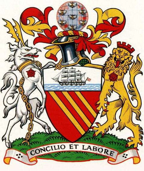
It only needs Don Kichot and The Three Musketeers.Whats everyones thoughts on the United crest? Personally, I don't like it. I think it looks kind of childish. I would much prefer one that encoporated the coat of arms rather than a Devil.
Who's up for a rebranding?
") . Having said that it should have "Football Club in it. Sadly, I think Luis Van Gaal was right when He recently said United is now a business rather than a football club.
. Having said that it should have "Football Club in it. Sadly, I think Luis Van Gaal was right when He recently said United is now a business rather than a football club. Don't forget doping.I agree. There's something undignified about the brightness of the red. Like a child's toy wagon. The old crest (1993) had the perfect colour combo.
Juventus' redesign makes it look like a logo that belongs to a johnny-come-lately sports brand like Under Armour or Gymshark. "The juventus way of living" - what's that? Bribing refs and bottling it in Europe?
Oh behave mate. I was hardly moaning and calling out for a re-brand. I just explained I was open to the idea. Yes I had a dig at the club for being slow to certain aspects like introducing a woman's team and only just now introducing a youtube channel. But I think that's valid!This is just moaning at the club for moanings sake...
Why do we need to re-brand it? This version of the crest was done as part of a re-branding process that occurred because different departments within the club used different versions of the old crest...
The only thing I'd do with the current one, is put Football Club back on it...
Boo, feck off, I like the devil.Whats everyones thoughts on the United crest? Personally, I don't like it. I think it looks kind of childish. I would much prefer one that encoporated the coat of arms rather than a Devil.
Who's up for a rebranding?
We need something modern and fashionable, to reflect the Caf's recently found love for pleasing-on-the-eye football above all else.
Nice...We need something modern and fashionable, to reflect the Caf's recently found love for pleasing-on-the-eye football above all else.
Just a rip off ofWe need something modern and fashionable, to reflect the Caf's recently found love for pleasing-on-the-eye football above all else.

That's because they are colonist at heart and plunder everything.I always wonder why countries put animals that don't live naturally in their country, on the cost of arms.
Yeah, we wiped them unicorns and dragons out completely. Rule Britannia.That's because they are colonist at heart and plunder everything.

So cute, they think that lions were only african. hahahaha. Just because we killed them all like the dumbasses we were/are doesnt mean they didnt exist in europeThat's because they are colonist at heart and plunder everything.
Tbf modern lions only really existed in the southern tips of Europe. Anything found further up north are usually fossils older than 50,000 years and therefore unrelated to heraldry.So cute, they think that lions were only african. hahahaha. Just because we killed them all like the dumbasses we were/are doesnt mean they didnt exist in europe
I think Jose won't last long! He is such a moody scrote.
There...
Lack of mentioning Jose in this thread is unaceptable!
P.S. Nothing wrong with our crest!
BAN! Ban this cnut! KiddingWe need something modern and fashionable, to reflect the Caf's recently found love for pleasing-on-the-eye football above all else.

Is their anything else united supporters want to complain about?
Your grammar
toucheWe need something modern and fashionable, to reflect the Caf's recently found love for pleasing-on-the-eye football above all else.
/Close threadShould be simplistic. I dabble in graphical design and made this:

The club has a strategy of waiting for social media platforms to mature before launching on them so while other clubs embarrass themselves trying to get to grips with new and developing formats, we let them work through the kinks and learn from their mistakes. It's worked a treat so far with Twitter, Instagram and YouTube.There's nothing wrong with a little re-branding but sadly our club live in the stone ages. Haven't we only just got an official Youtube channel now and introduced a woman's team. A new club crest will probably be done in 100 years.
No more, pleaseI personally quite like the current design of our badge though it could probably do with a some slight design changes to improve the overall appeal of it.
However I made these just to showcase a design aspect in which our club may choose to implement if it's decided the badge needs a change in favour of a more "brand orientated" route.


And what a showcase that wasI personally quite like the current design of our badge though it could probably do with a some slight design changes to improve the overall appeal of it.
However I made these just to showcase a design aspect in which our club may choose to implement if it's decided the badge needs a change in favour of a more "brand orientated" route.
No, but he’s about to get fecking lynched!* Are you David Lynch?
