What was your favourite United shirt sponsor?

Vote


  • Total voters
    227
  • Poll closed .

forevrared

Full Member
Joined
Oct 3, 2009
Messages
5,379
Location
Bay Area
Probably Sharp or Vodafone. Sharp was the cleanest IMO, but I really enjoyed some of the Vodafone shirts. At the end of the day it's probably childhood nostalgia, but almost anything would be better than Chevrolet.
 

tentan

Poor man's poster.
Joined
Oct 5, 2013
Messages
4,584
Can't choose between Sharp, Vodafone or AIG.

Sharp was just so iconic in many ways with United dominating the 90's and everything.
Vodafone just seemed to go well with kits down to a T.
And AIG also looked well suited to the kits.
 

0le

Full Member
Joined
Dec 25, 2017
Messages
5,806
Location
UK
Note sure I have a favorite because I think some are very similar, but if pushed I'd say Sharp, for the nostalgia. I do not however like the bright gold logo of Chevrolet.
 

Fortitude

TV/Monitor Expert
Scout
Joined
Jul 10, 2004
Messages
22,891
Location
Inside right
Sharp, by miles.

The Sharp adidas kits are the best we've ever had (during the commercial age), too.
 

Fridge chutney

Full Member
Joined
Sep 11, 2016
Messages
8,963
I liked clean shirts before logos but if I had to choose one it would be Sharp for sure. We won the treble in Sharp.
 

WR10

Correctly predicted France to win World Cup 2018
Joined
Jul 19, 2009
Messages
5,644
Location
Dream
If you’re younger than 30 = AIG older = sharp
 

Van Piorsing

Lost his light sabre
Joined
Feb 10, 2006
Messages
22,557
Location
Polska
First TV bought by my own money - Sharp.

Year of Sharp sponsoring United for the first time - born same year.

Lee Sharpe and list goes on & on, so it has to be AON because of white text.
 

prateik

Full Member
Joined
Dec 14, 2005
Messages
42,200
Knew the answer was going to be Sharp before I clicked the thread.. Easy winner there.. first, a lot of great memories and not too shabby looking either.

I really liked the vodafone too.. that black one.. first one I owned.

And AIG from 2006-07 .. again. Fantastic memories.. everything about it was great.. the united logo sewed on looked amazing too.
 

Fridge chutney

Full Member
Joined
Sep 11, 2016
Messages
8,963
The advertising on this website is hilarious.

On this thread im getting adverts for sharp knives.
 

Cloud7

Full Member
Joined
Jan 11, 2016
Messages
12,874
I genuinely like the Chevy logo. Gold is one of my favourite colours and I love seeing the gold logo on our shirts. I’ll probably be the only person in this thread saying that that one is my favourite :lol:
 

Deleted member 101472

Guest
Didn’t really think much of sharp to be honest, it had no logo and was literally just the letters SHARP in times new Roman size 36. The longer you stare at the tops with sharp on it, the weirder it looks.

Vodafone was simple and has the logo to go with it.
 

Web of Bissaka

Full Member
Joined
Feb 20, 2017
Messages
8,553
Location
Losing to Comeback Winning!
1. Sharp, the best one by far, no contest really -- meaning fits United the most, cool simple logo, have the classic look and strong historical mark with this kits but tbh plenty of the kits are over designed but that's mostly because of Umbro and then Adidas. Idk, the many designed features are just too messy for me, simpler design is the best. Nevertheless, many iconic designed kits from this.

---

2. Chevrolet, not because of the horrible humongous logo, but more so because of the designs by Adidas and Nike -- many kits are just awesome, and modern look. Some kits also have themes, creatively done. Now if they could idk edit the size of that logo symbol or just the name Chevrolet suffice without the off-putting headlight/whatever that "+" is.

*2nd and 3rd is very close to each other.*

3. Vodafone, unique cool logo, and the kit design also embodied that uniqueness. After the classic Sharp of the 1990s, this newer modernize techno look of early 2000s is a nice signal change towards a newer generation of United -- RVN, Ronaldo, Rooney, etc. The black vodafone kit is just awesome. Potential, could have been better.

---

4. Aon, back to simple logo, nice and look sweet.... yet ruined horribly by terrible kit design by Nike, what the hell did their team were thinking with that dreadful tablecloth. Other design is just nice and neat, nothing special.

5. AIG, shit logo. Annoying rectangular box, if only they could remove that terrible feature. Most of kits designs are pale and boring, except two which is my most fav kits --the home red and away black kits Season 2007/8 with "tails" at the back. Ronaldo's best season.
 

meamth

New Member
Joined
Jun 3, 2017
Messages
5,946
Location
Malaysia
I genuinely like the Chevy logo. Gold is one of my favourite colours and I love seeing the gold logo on our shirts. I’ll probably be the only person in this thread saying that that one is my favourite :lol:
Same here, Chevy logo makes the kit more exclusive for me.
 

MC89

Full Member
Joined
Oct 5, 2018
Messages
1,528
Location
Glasgow
Supports
Celtic
AIG - my favourite strip 07/08 season home and away, with the stripe going down the back
 

Revaulx

Full Member
Joined
Mar 17, 2014
Messages
6,046
Location
Saddleworth
Same here, Chevy logo makes the kit more exclusive for me.
I think it looks really nice on blue, ok on black, too showy on white and terrible on red.

@Rifer is spot on about Aon. Their logo would get a lot more love had it not been displayed on a series of terrible shirts.
 

Revaulx

Full Member
Joined
Mar 17, 2014
Messages
6,046
Location
Saddleworth
Didn’t really think much of sharp to be honest, it had no logo and was literally just the letters SHARP in times new Roman size 36. The longer you stare at the tops with sharp on it, the weirder it looks.

Vodafone was simple and has the logo to go with it.
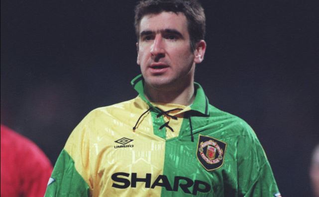
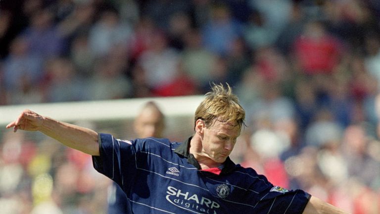
Pretty certain Sharp wasn’t Times, which is a serif typeface. Helvetica possibly?

You’re right about it being dull though.
 

meamth

New Member
Joined
Jun 3, 2017
Messages
5,946
Location
Malaysia
I think it looks really nice on blue, ok on black, too showy on white and terrible on red.

@Rifer is spot on about Aon. Their logo would get a lot more love had it not been displayed on a series of terrible shirts.
Perhaps if they make it all white chevy logo that could make it more sleek. I guess.
 

Big Ben Foster

Correctly predicted Portugal to win Euro 2016
Joined
Mar 19, 2008
Messages
12,956
Location
BR -> MI -> TX
Supports
Also support Vasco da Gama
AIG had the nicest kits but was a horrendously ugly sponsor. Aon was pretty nice looking but the corresponding shirts were forgettable - really like our training shirts though.

Vodafone was my favorite, followed by Sharp.

Chevy is an abomination (and this is coming from someone who actually likes the brand and the cars).
 

klsv

Full Member
Joined
Jun 16, 2016
Messages
1,916
Sharp and Vodafone for me.

What does Sharp do these days anyway? Haven't seen anything by them in stores for ages.
 

Devil81

Full Member
Joined
Aug 7, 2014
Messages
6,691
Sharp was the sponsor from my youth, so that's the first that springs to mind.
 

Pass and Move

Full Member
Joined
Jul 15, 2014
Messages
801
Sharp, but really it doesn't matter.

What we should focus on is getting collars back on the shirts. Ones that can stand up.
 

Fracture90

Full Member
Joined
Sep 15, 2016
Messages
10,360
Location
Serbia
No pun intended but Sharp always looked Sharp, though Vodafone is a great shout as many have said as well.