
- Joined
- May 2, 2019
- Messages
- 108
Magnificent in its hideousness.This can't be topped...

Reg. the second one, I wonder how anyone can come up with that and think "yeah, that's really great". The style, the coloration, the advert, it's a cocktail of vomit. Truly terrible and a potential winner IMV.The Celtic have had a few howlers.
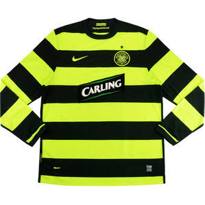
Namely. The bumblebee.
And the papa.
Heck seems about right
I know some people claim to actually like these '94 WC kits but they're either deranged, ironic or nostalgic.
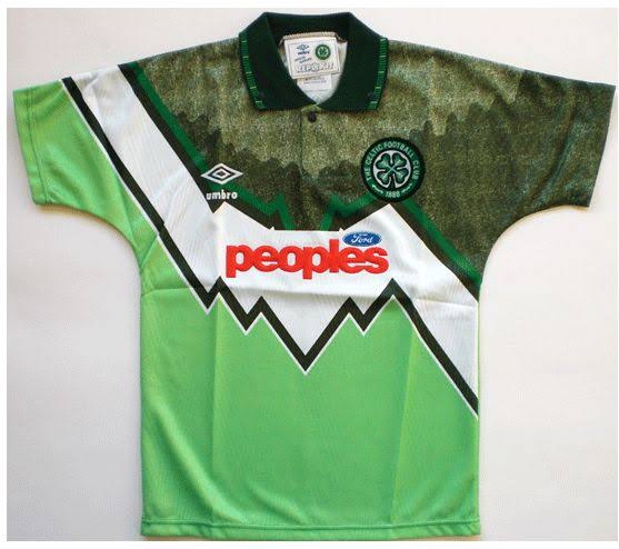
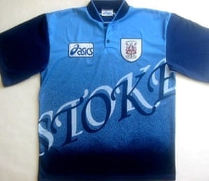
The second Celtic away is actually pretty clever, it's a graph showing the steady decline of the standard of the SPL.The Celtic have had a few howlers.
Namely. The bumblebee.
And the papa.
Heck seems about right
 my first thought, one heck of a shirt indeed.
The only thing rivalling the kit is the haircut (left)Heck seems about right
That’s absolutely horrendous.
It's far from the worst one in the thread so far, but this thing was horrific.
That's a fecking eye sore
It's far from the worst one in the thread so far, but this thing was horrific.
The brown one? Made them look like a bunch of dog turds running round the pitch. Wonder if Jimmy Hill designed it.Coventry had an awful one in the late 70s
And Dundees "tartan"shirt from the 50s was legendary
But Regginas "muscle-shirt" from 2012 must surely be the most tacky ever.
Looks great now.First entry:

It won't be allowed btw just used in a friendly. I can't seem to find the round-neck cotton-looking Liverpool kit from the 90s, but that's one of the worst I can remember.
Tweet
— Twitter API (@user) date
it's like a Miss World sash circa 1970First entry:
It won't be allowed btw just used in a friendly. I can't seem to find the round-neck cotton-looking Liverpool kit from the 90s, but that's one of the worst I can remember.
Oh I'd love to see Pogba wearing tassles.. be even more of a diva1978 Colorado Caribous. I can't embed Images yet so you'd have to Google it.
Yep, looks fantastic with no logo on the foam.
It’ll look great down The Swan and PaedoYep, looks fantastic with no logo on the foam.
ExcellentIt’ll look great down The Swan and Paedo

 I actually like three kits in page 1, looks nice and/or cool.
Go ahead and post it so we can have a laugh. I don't support any Scottish teams so I've no idea.What was that one Sevco wore in Scottish League 3?
IncredibleThis can't be topped...
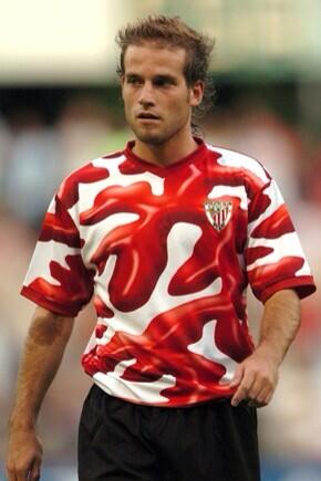
Jeez, that is horrendous.Bilbao 2004
More like Stevie wonder designed itThe brown one? Made them look like a bunch of dog turds running round the pitch. Wonder if Jimmy Hill designed it.
As it came out in the early 1990s, it perfectly charted Celtic’s sinking standing in the Scottish game at the time.The second Celtic away is actually pretty clever, it's a graph showing the steady decline of the standard of the SPL.


How can someone be so horrendously creative to be able to come up with something like that? I don't think a lot of people can come up with a worse kit even if they tried.This can't be topped...
Wtf is that? The Colorado one wins, but am also baffled that anyone thought this was a good idea from concept to execution.
.Is it bad that I love that kit?
It's far from the worst one in the thread so far, but this thing was horrific.
I've said this before, but that uniform looks like what a male stripper would wear when arriving on stage, only to strip it immediately off.This can't be topped...
Yep definitely one of our worst ones, still see people in them though!
)I can't help but think you're asking for your shirt to be pulled with those tassels on it.This can't be topped...
"He asked for it"I can't help but think you're asking for your shirt to be pulled with those tassels on it.
Yeah this has to be the worst oneBilbao 2004
I'll take your word for it.I've said this before, but that uniform looks like what a male stripper would wear when arriving on stage, only to strip it immediately off.
Yes, yes I am, they knew what they were doing when they put those jerseys on!"He asked for it"
Are you victim-blaming?
Imagine entering the pitch in that jersey 5 kilos overweight


