Chevrolet Logo Discussion (Manchester United Kits 2015/16)

Rado_N

Yaaas Broncos!
Joined
Apr 6, 2009
Messages
112,122
Location
Manchester
It's been annoying me for ages that all the new kit pictures are being posted in the 14/15 thread, so here's a new one for the right year.

Going from apparentl 'leaks' our first new Adidas shirts will be as follows:


2015050612412894996813.jpg

2015041413460385446982.jpg

OrangeKit.jpg


Keeper:

2rg145c.jpg
 
The keeper kit is awful. The rest are good but the home is sexy as f*ck!
 
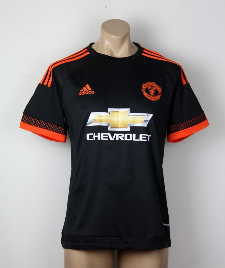
I hate Chevrolet. Those kits would be great if it wasn't for their insistence on a full-colour logo.

Also, the third kit really should be red instead of orange.
 
I don't even care about the Chevrolet sponsor, I pretty much just blank out sponsors on all kits and don't even notice them. What I really hate is that orange badge on the third kit. Our badge isn't fecking orange.
 
Now we know the real reason DDG wants to leave.
 
It'd be fecking brilliant if everyone got over the Chevy logo and realised that it's going to be our sponsor for at least another 5 years..

And no, they're not going to alter the colours or the design of it.

Like all three outfield kits, probably in the order they're shown.

Keeper kit is awful and I understand why DDG isn't signing a new deal now.
 
Don't really like the away, but that keeper kit is something else. Fecking disgusting.

I'll deffos be picking up the home and third kits though.
 
That GK kit will almost certainly come in 3 colors too. Might look good in black or red.
 
It'd be fecking brilliant if everyone got over the Chevy logo and realised that it's going to be our sponsor for at least another 5 years..

And no, they're not going to alter the colours or the design of it.

Wishful thinking.
 
I hate Chevrolet. Those kits would be great if it wasn't for their insistence on a full-colour logo.

This. This. This.

The lettering 'chevrolet' in white/black would look great. Even having the cross logo in plain white/black would look fine.

As it is, it wrecks the kit for me - gold is a colour, and it fecks up the red, white and black of our colour code.

No Utd kit has ever had a colour logo before, at least not that I remember. They were always white on the red shirt.

It's a lovely top ruined by a tacky, gaudy logo.
 
It's been annoying me for ages that all the new kit pictures are being posted in the 14/15 thread, so here's a new one for the right year.
Thank feck for that, its been annoying the hell out of me too.
 
That home shirt is the sex, hope its genuine.

When will we reveal our kits for next season? Anyone know?
 
That home shirt is the sex, hope its genuine.

When will we reveal our kits for next season? Anyone know?
The Nike deal doesn't expire until 31 July, so probably 1 August.

Unless the club and/or Adidas negotiate some kind of buy-out with Nike in order to wear the new kits on the tour.
 
The 2 away kits are great although I'm not sure about the home shirt. It's not bad but im not keen on the black and white neckline and end of the sleeves they look too thick.
 
Expensive summer ahead for me…got to buy the lil mans Kits to! :rolleyes:

I might just say to him that the goalies top is the home top…even he at the age of 3, may refuse me to buy it him! :devil:
 
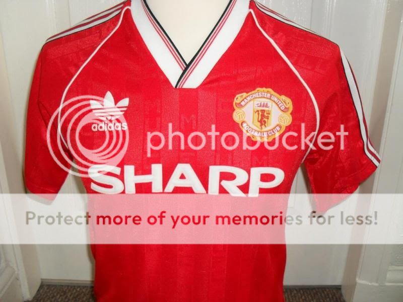
So, for anyone interested, this is the kit that the new home shirt is aping. It's a shirt really close to me because it was the first Utd shirt I ever owned as a boy. And as a fan of decent clothes/casual fashion, I think it's a beautiful kit.

The 'Sharp' logo looks great - it was made out of this lovely raised felt that would peel off after a few years of footy in the rain and repeated washing machine cycles!

manchester-united-1988-home-sharp.gif


manchester-united-home-football-shirt-1987-1989-s_3017_1_zpsa01a8858.jpg


For me, as a bit of a purist, the coloured logo really does wreck the new shirt.
 
I don't expect Chevy to not use the full colour logo, but they really should have done on that black kit. The United badge is single colour to match the trim, but that golden logo clashes horribly. It'd look pretty neat if it was orange text and an orange outline of the Chevy emblem. I don't have a problem with the Chevy logo on the other two kits.
 
It'd be fecking brilliant if everyone got over the Chevy logo and realised that it's going to be our sponsor for at least another 5 years..

And no, they're not going to alter the colours or the design of it.

Like all three outfield kits, probably in the order they're shown.

Keeper kit is awful and I understand why DDG isn't signing a new deal now.


That's fine seen as though you seem to like it fair enough but the vast majority thinks the gold looks cheap and tacky and they're right but we're stuck with it so no point moaning.

I like the home kit the rest are awful imo
 
Statistically the flourescent colours make players appear with more clarity in the peripheral vision. As a fan of stats, I'm sure Louis would have a minor input in that if the flourescent stuff is the way we go on alternate kits or piping/outlines at least.
 
Love the home and away, third would be a million times better if it was red and not orange, the keeper kit is basically Peter Cech, which is a shame because our keeper kits always looked great on De Gea I think and now he'll have this fluorescent yellow thing.
 
They should have put shorts on the mannequin. It's creeping me out.
 
Not a fan of the home kit, I it would look way better with the black on the collar and sleeves.

Away and 3rd kits are nice though.
 
That's fine seen as though you seem to like it fair enough but the vast majority thinks the gold looks cheap and tacky and they're right but we're stuck with it so no point moaning.

I like the home kit the rest are awful imo

For what it's worth. I don't like it, but I don't think it ruins kits like people on here seem to.

But as you say, we're stuck with it, which is the quick way of making my original point.
 
Home and away kits look really good, 3rd one is meh, and the goalie jersey is just awful. For the amount of money that Chevrolet is paying, i don't care about the logo one bit.
 
Quite like them. Would prefer that third kit to not have those random spots at the end of the sleeves, and have a red shade instead of orange. But they're decent overall.

Not liking the fluorescent keeper one though, reminds me too much of Chelsea for some reason :lol:
 
I don't hate the goalie kit. Maybe it's because I run in that colour most evenings... It's about as simple as you can get. One colour with black Adidas stripes.

Out of the three kits, the home one is the worst for me. We had to play our last two Champions League finals in away kits, which I didn't like, but I'll be quite happy when we wear either the away or third kit for the 2016 final...
 
I would love that home kit if it wasn't for the weird Ice Hockey sleeves.
Hopefully it's just the way it's hanging on the mannequin.
 
Home and away kits are nice but the Chevrolet ruins them therefore will not be getting any.
 
I hate Chevrolet. Those kits would be great if it wasn't for their insistence on a full-colour logo.

Also, the third kit really should be red instead of orange.

Yep, not sure where the orange comes from but I do like the home and away shirts there. Prefer a green goalkeeper shirt but looking forward to the change back to Adidas. Was a big fan of their mid-late eighties United shirts.
 
I'm one of the few that don't actually mind the Chevvy logo. Granted it would look better simplified to just one colour but gold on red looks alright to me (be thankful it's not blue or green!).

Home shirt looks ok to me, still think white and black trim is unnecessary as I'd rather we just had white round the collar but it's pretty good overall I guess.

Away shirt is my favourite of the lot, hope the Chevvy logo isn't as high in the final release as it seems to be in that picture. Also don't know what that skirt bit is at the bottom.

Third kit also looks great, wish it was red instead of orange and the full coloured badge not the simplified one. Always thought the full badge looks brilliant on black (like De Gea's black kit this season).

I'll probably buy the white away shirt if these are legit.
 
They just don't feel like Manchester United kits to me, so it's going to probably take me a while to warm to them.

I know that sounds dumb because we've had Adidas in the past, but that was before my era.
 
Yep, not sure where the orange comes from but I do like the home and away shirts there. Prefer a green goalkeeper shirt but looking forward to the change back to Adidas. Was a big fan of their mid-late eighties United shirts.
Only connection I can think of is cause van Gaal is Dutch but surely that's a very strange idea to design a kit on.