Stickles
New Member
- Joined
- Jun 17, 2013
- Messages
- 1,576
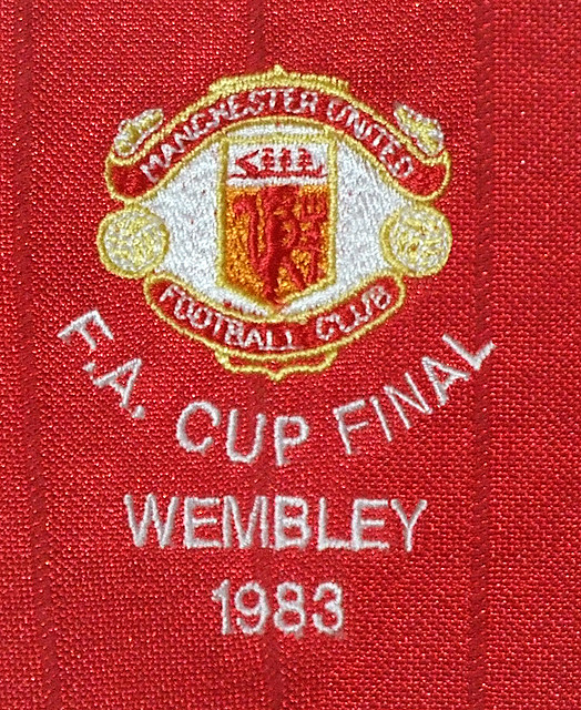
To play devil's advocate...Does anyone prefer the badge not to have "Football Club" on it?
If anyone does, then I'd be interested to know their reasons. The way I see it, there are one or two fair reasons for adding it back, but I don't know any good reason against adding the words back onto the badge.
If you work in marketing you'd much rather have the name 'Manchester United' in as big a writing as possible on it rather than share space with what could even in the best spirit in the world be described as fairly redundant lettering.
I think returning it would be a nice touch but I guess that would be an argument for not reinstating it to the badge as was likely the argument for removing it in the first place.