Best crests in football?

Fortitude

TV/Monitor Expert
Scout
Joined
Jul 10, 2004
Messages
23,441
Location
Inside right
I think those of us who ever collected Panini sticker albums will have more of a fascination with this than those that didn't.

Just to get it out of the way, although it is my favourite badge of all clubs:


Rivals: you have to admit, this badge is better than yours. It's nothing to be ashamed of. ;)

Oldham have a great badge. It's the badge of a team who should be right at the top with its coldness and intimidation factor. Could do with a 'FAM' in place of the 'AFC' for extra points. Feels quite wasted on them, even.


Wolves. If they ever become the superpower they're aiming to be, they're sorted on the merchandising end with their Batman-esque badge:


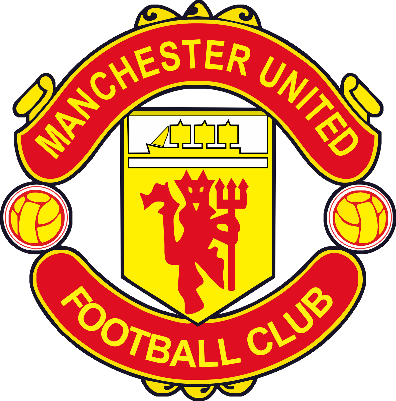
Never liked it, but if you asked someone who had never watched football whose badge most represented the club with the most European Cups, they're going to pick this out of a line up, aren't they?


cnuts.

It would be disingenuous to not give it its due... it's a badge befitting of an enemy, both detestable and imprinting... even the stupid wording on the top generates a gnashing of the teeth and the crest has actually been impressively remodeled for the flames to be added and represent the victims of Hillsborough.


Having washed my mouth and eyes out, I shall open the floor.

They're my top five crests for varying reasons. What are yours?
 

meamth

New Member
Joined
Jun 3, 2017
Messages
5,946
Location
Malaysia
The pinnacle of modern/minimalist design in world football. The first to apply it as definitive modern branding in it's logo:


ROFLUTION

Full Member
Joined
Jan 22, 2009
Messages
7,752
Location
Denmark
The pinnacle of modern/minimalist design in world football. The first to apply it as definitive modern branding in it's logo:


I still just see the word JI og Jj.
Good direction with going minimalistic, good overall typography for SoMe/hypevideos, but the logo design itself is bad use of designer/ gestalt-laws to me.
 

meamth

New Member
Joined
Jun 3, 2017
Messages
5,946
Location
Malaysia
I still just see the word JI og Jj.
Good direction with going minimalistic, good overall typography for SoMe/hypevideos, but the logo design is bad use of designer/ gestalt-laws to me.
I see, but what I see is that iconic black and white stripes that is always associated with the Turin club. Furthermore, the "J" seems to mimic the head of a bull from the side view. Which, for me is really creative.
 

12OunceEpilogue

In perfect harmony
Scout
Joined
Oct 2, 2016
Messages
18,454
Location
Wigan
The Oldham owl is great, so stoic and bedraggled.

To continue the theme:


As a boy I strongly recall being fascinated by the word 'Wednesday' in a football team's name and liked the owl design on the left-hand badge. Their newer/old crest isn't really my cup of tea but generally-speaking it's nice to see old designs being brought back.

:lol:
 

SilentWitness

ShoelessWitness
Staff
Joined
Jan 14, 2010
Messages
31,999
Location
London
Supports
Everton


My favourites.
 

Raees

Pythagoras in Boots
Joined
May 16, 2009
Messages
29,479
Barca, Dutch national team, Atletico, Inter. The inside of our badge is fantastic but always felt we could do better with the rest of the outline.
 

ROFLUTION

Full Member
Joined
Jan 22, 2009
Messages
7,752
Location
Denmark
I see, but what I see is that iconic black and white stripes that is always associated with the Turin club. Furthermore, the "J" seems to mimic the head of a bull from the side view. Which, for me is really creative.
Each to their own understanding, and if you like it, you simply like it.

From my perspective, there's no historic association between a bull and Juventus, even though I see what you mean. The problem to me is that:

1) The first look you take it looks like a Ji / JJ. No I or double J is in "Juventus", which therefore makes it un-aligned with the club-name.

2) The white/blank line in between the JI / JJ is also something the eye wonders over and as a designer makes you go "Why?" as it optically competes with the JI / JJ, giving them all attention at the same time. It's like the eye tries to look and make sense of all 3 "letters" at the same time, and none of the 3 letters gives any reasonable answer or anecdote to history or the club.

Anyways, as you, I like the way they go with black and white. Something very aesthetic to that.
 

meamth

New Member
Joined
Jun 3, 2017
Messages
5,946
Location
Malaysia
Each to their own understanding, and if you like it, you simply like it.

From my perspective, there's no historic association between a bull and Juventus, even though I see what you mean. The problem to me is that:

1) The first look you take it looks like a Ji / JJ. No I or double J is in "Juventus", which therefore makes it un-aligned with the club-name.

2) The white/blank line in between the JI / JJ is also something the eye wonders over and as a designer makes you go "Why?" as it optically competes with the JI / JJ, giving them all attention at the same time. It's like the eye tries to look and make sense of all 3 "letters" at the same time, and none of the 3 letters gives any reasonable answer or anecdote to history or the club.

Anyways, as you, I like the way they go with black and white. Something very aesthetic to that.
I see what you're trying to say. Make sense, but once your brain registered that image in the brain, it will stay there forever.

I agree with your vision, but I think this is the way forward if we want to commercialize our branding.

Don't get me wrong I love United logo as it is, but I think we can modernize it for the future.
 

altodevil

Odds winner of 'Odds or Evens 2023/2024'
Joined
Oct 16, 2013
Messages
18,273
Probably the ones that have become iconic over the years: Milan, classic Inter, Roma, Valencia, Ajax etc.
 

Lay

Correctly predicted Italy to win Euro 2020
Joined
Jan 29, 2013
Messages
20,404
Location
England
Roma, Valencia and Lincoln Red Imps
 

KirkDuyt

Full Member
Joined
Nov 25, 2015
Messages
24,929
Location
Dutchland
Supports
Feyenoord
Wish I could say Feyenoord, but alas


At least it's better than that dumb Ajax thing with the leprechaun looking dude on it


Sparta's pretty good


P-Nut

fan of well-known French footballer Fabinho
Joined
Oct 16, 2015
Messages
21,778
Location
Oldham, Greater Manchester
For some reason I've grown fond of the Livingston badge. Even swapped over to it on FIFA, would look so sweet on a black kit.


vadimivich

Full Member
Joined
Jan 3, 2013
Messages
875
Location
Wien, Österreich
Supports
Tottenham Hotspur
Admira Wacker in Austria has a great crest, love the odd shape for it too.


And the Wales National Team crest is amazing


And finally ... nobody has said Tottenham? It's an awesome crest, and so easily identifiable and unique.


RochaRoja

Full Member
Joined
Jun 15, 2018
Messages
1,567
The less heraldry, the better. Latin mottos on crests (usually in some sort of scroll design) are my pet hate and dates or unnecessary shields also annoy me.

A decent football crest should be a striking and classic image that doesn’t even require the club’s name in my opinion. If it looks good on a ball cap, all the better.
 

RochaRoja

Full Member
Joined
Jun 15, 2018
Messages
1,567
Wolves. If they ever become the superpower they're aiming to be, they're sorted on the merchandising end with their Batman-esque badge:

The old version was much cooler.


The Liverpool badge epitomises all the busyness that I hate in football crests. I know the significance of the Hillsbrough stuff but it doesn’t make for good design.

The simple liver bird on their kits is much better (but lose the “LFC”, it’s unnecessary).
 

jeff_goldblum

Full Member
Joined
Dec 6, 2011
Messages
3,917
Can't post a pic at work but that italian team whose crest is a sailor smoking a pipe.