Heinzesight
Full Member
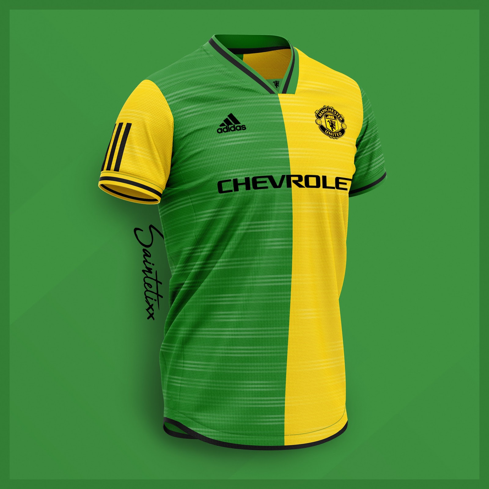
On the latest leaks I am leaking all over the shop over the green one.
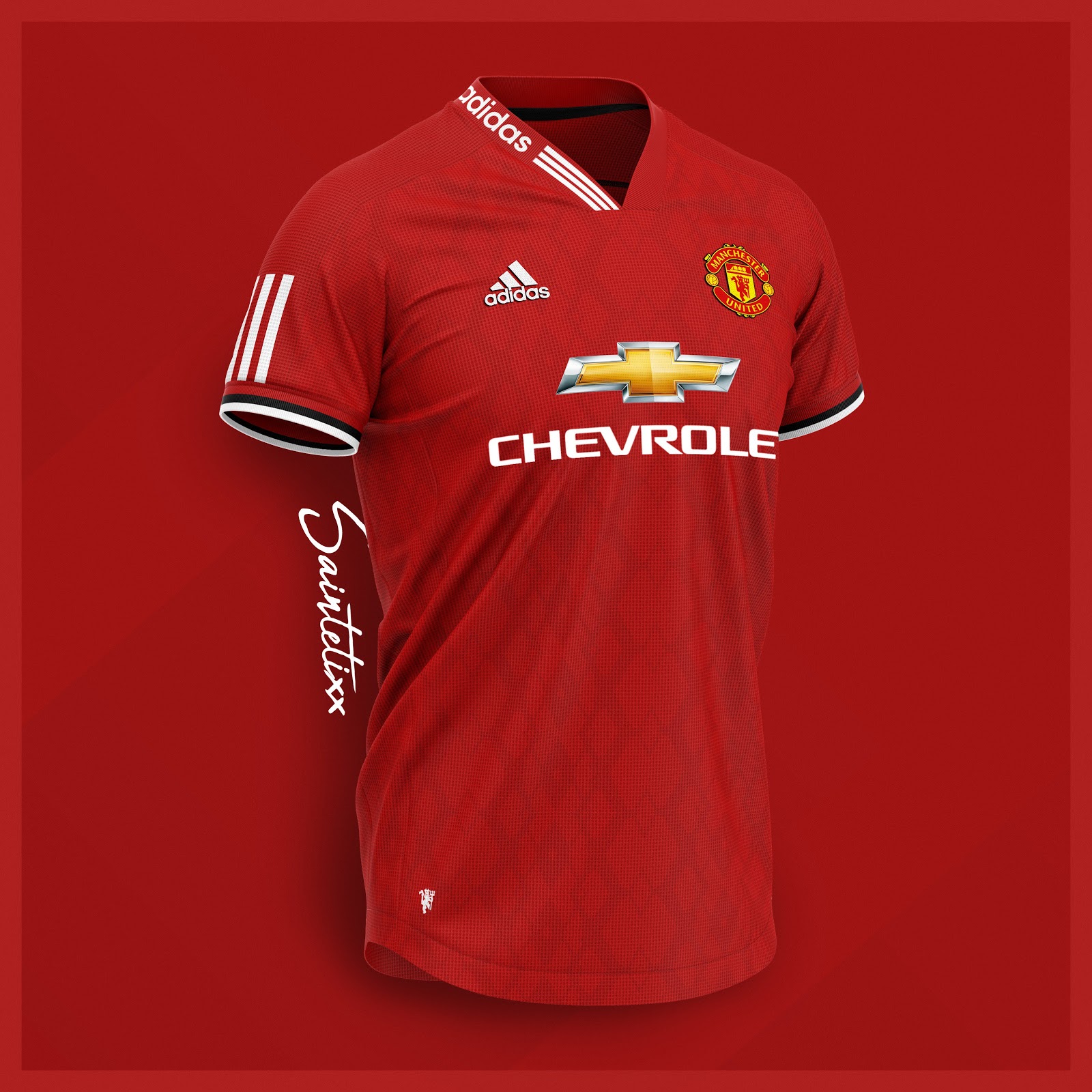
I actually like the home bus seat one.
Third kit is a horror show.
I actually like the home bus seat one.
Third kit is a horror show.
I hated it at the time, but we've had much worse since, so it's made me reassess it. Watching Van Persie score that volley in it helped its appeal too.The tablecloth grew on me, but only because of the season it was worn in. Aesthetically, it's awful.
They don't do that because it lets the manufacturers of knock-offs get ahead of the game and beat them to market.I am not talking about a competition... I am talking about leaking designs unofficially just to see which ones prove popular. Obviously the idea is the fans would not know whether they were real Adidas designs or not.
I thought our 06/07 home kit was pretty smart. That one had gold trimmings in it, so when done right, you can use something other than black and white.I have a theory that red is too difficult to work patterns into and that it should always stay plain, except when accentuated with white - creating a contrast that's easier on the eye. Possibly blue but the contrast is always iffy when two primary colours are used together. Black can work too.
Surely a graphic designer who has trained in colour theory should realise this?

Could work, how would they get data of which ones are liked the most?I am not talking about a competition... I am talking about leaking designs unofficially just to see which ones prove popular. Obviously the idea is the fans would not know whether they were real Adidas designs or not.
I think only the train track black one has been worse to be honest.I hated it at the time, but we've had much worse since, so it's made me reassess it. Watching Van Persie score that volley in it helped its appeal too.
The fact that we have yellow on our logo is my line of thinking, too. Though I suppose they think they can get away with not having a yellow kit because they have our keepers use yellow sometimes (which always looks nice) but that doesn't cut it, I'm afraid.You and me both. That or orange would be epic.
Considering we have yellow in our logo etc, I'm surprised we haven't done it for years
I can't remember when we last had a yellow kit. Excluding goalie shirts, the last time we had any yellow on an away kit was this (I think):Since 1973? I suppose it's more likely at some point with Adidas bringing in new colours besides the white, blue and black that Nike stuck to.
")
I don't know which person you saw it in, but unless it was Emilia Clarke or Scarlett Johannsson then I suggest you hire somebody to assist you in crossing roads.I thought the gold one we have this year looked awful in all the previews and pictures then I saw it in person and its actually really nice.
Maybe the zebra pattern will look nicer in person because its just serving to make me dizzy looking at the pictures.
Ill be getting the home kit regardless even though I really dont like it at the moment.
That’s basically our kit from a few years ago?I thought our 06/07 home kit was pretty smart. That one had gold trimmings in it, so when done right, you can use something other than black and white.
Our best kit ever imo, the 07/08 one did it the best. Predominantly red, with varying shades of red to provide certain patterns, accompanied by clever use of white and black.
In terms of red kits, I always thought Adidas perfected it way back in 2013/2014.
was thinking the same. Absolutely no way Adidas would do this.Looks like a Liverpool kit
Its actually more of an Olive Green rather than mintI agree on the green one, it's actually mint
Yeah that does work. I guess you can see it too in the Sharp one from the mid-90s with OT emblazoned on it. The two reds sit nicely.I thought our 06/07 home kit was pretty smart. That one had gold trimmings in it, so when done right, you can use something other than black and white.
Our best kit ever imo, the 07/08 one did it the best. Predominantly red, with varying shades of red to provide certain patterns, accompanied by clever use of white and black.
In terms of red kits, I always thought Adidas perfected it way back in 2013/2014.
Ours was ever so slightly differentThat’s basically our kit from a few years ago?

Different collar, different cuffs, no subtle pattern and totally ruined by the Chevy sponsor.That’s basically our kit from a few years ago?
I don't think Chevrolet would be too happy if we decided to play down the in your faceness of their logo, considering they're paying us to show it offIt's annoying that Adidas won't change the colour of the Chevrolet logo but have no problem changing the colour of our club badge on the away kits. It just makes the away kits look cheap and washed out when the badge colours are changed to whatever the away kit colours are. It speaks volumes that kit manufacturers can dick about with our crest but the hideous sponsor logo is off limits.
1 season after this one and we are done with them thankfully.I don't think Chevrolet would be too happy if we decided to play down the in your faceness of their logo, considering they're paying us to show it off
The chevrolet argument has been done to death but on their own nascars they have a white logo with no gold.I don't think Chevrolet would be too happy if we decided to play down the in your faceness of their logo, considering they're paying us to show it off
But if I'm paying you an obscene amount to promote my brand, I want the biggest, boldest logo being shown... I don't care about your football kitThe chevrolet argument has been done to death but on their own nascars they have a white logo with no gold.
Looks like they started printing the Crystal Palace kit and the printer got jammed half way through.Anyone moaning at Adidas go look at Chelsea's Third kit
Every other football team in the world is able to change the colour of the logo of the sponsors to suit their kits.But if I'm paying you an obscene amount to promote my brand, I want the biggest, boldest logo being shown... I don't care about your football kit
Like?Every other football team in the world is able to change the colour of the logo of the sponsors to suit their kits.
When you’ve spent what Chevvy have to sponsor a team in a market that you’re not even active in, you’ll want your premium minging gold logo as large as possible. (I also think they won’t renew and it must be running out soon, surely?)Every other football team in the world is able to change the colour of the logo of the sponsors to suit their kits.
Well we were able to keep every sponsor on the home shirt in plain white text until we sold it to Chevrolet for a start.Like?
The club are the ones who switched to favouring monochrome crests/logos, and they did it some years back. Everything that comes out of branding is in monochrome if possible, it's not a thing that Adidas started. Nike's away kits also had monocrome crests from 2012 to 2014.It's annoying that Adidas won't change the colour of the Chevrolet logo but have no problem changing the colour of our club badge on the away kits. It just makes the away kits look cheap and washed out when the badge colours are changed to whatever the away kit colours are. It speaks volumes that kit manufacturers can dick about with our crest but the hideous sponsor logo is off limits.
Then why do it on their own cars?But if I'm paying you an obscene amount to promote my brand, I want the biggest, boldest logo being shown... I don't care about your football kit
Probably to do with the Chevrolet branding on United's kits being aimed primarily at a UK / European market, where the full colour logo is used exclusively? Or I should say 'was used', since they don't operate here any more.Then why do it on their own cars?
That's true, I remember a few Umbro kits like that too. Wolves away kit was a good example of a badge not in monochrome last year working well. The gold and black badge stood out on an otherwise plain white kit.The club are the ones who switched to favouring monochrome crests/logos, and they did it some years back. Everything that comes out of branding is in monochrome if possible, it's not a thing that Adidas started. Nike's away kits also had monocrome crests from 2012 to 2014.
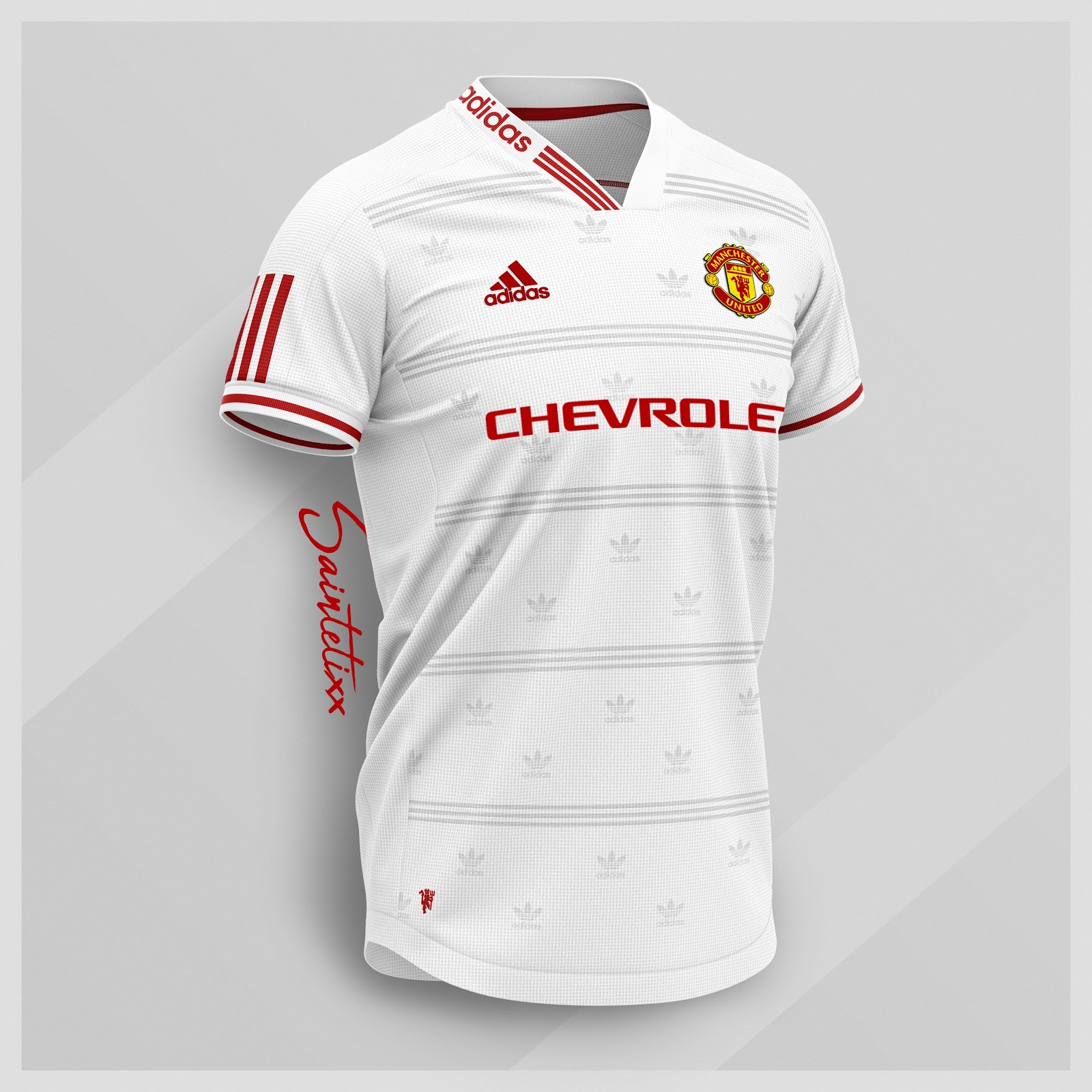
Would most definitely love thisStill waiting for a yellow away shirt.