
Xander45
Know-It-All Champion May 2009
You know what i like that. We'll have to see what actually happens though.
Which made them different.No it doesnt, we had both Vodafone and AIG on the blue kit of 2005
But not "new". Same kit, different sponsor's logo.Which made them different.


I like it.
Yes please!probably fake

I definitely buy that green and gold one, it looks brilliant!
 Nobody took your bait.
Ooh, that's sexy. Retro stuff.
Here's another one
great shit
great shit
in that order
I prefer the AIG logo to Vodafone one.They all look quality. The Aon logo looks so much better than the AIG logo.
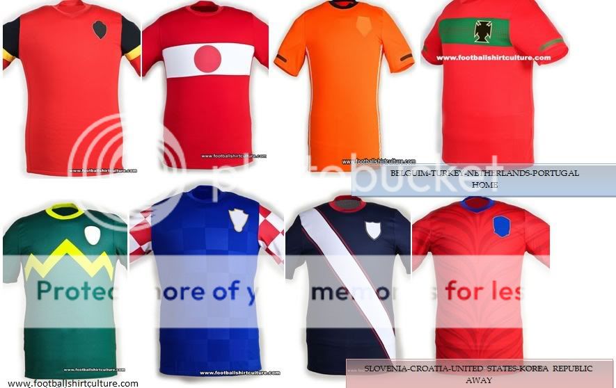
that bottom right one looks like it has a tire imprint on itA good indicator of the type of shirts Nike are going to release are their designs for the international shirts Nike make in advance of the World Cup, Football shirtculture.com - step into the world of football shirts | Football Shirt Culture.com shows a few advanced shirts, these are a few of them...
If we're to be retro, this suggestion would get my nod.So going by MST3K's vague discription, nesxt season's home kit could look something like this, I suppose (obviously there's a lot of guesswork involved):

Well do it is the Korean shirt, Nike thought that they would do them a favor and merge their passion of football with their passion of roadkillthat bottom right one looks like it has a tire imprint on it
Fixed.You guys just want it so you can pop the collars and succeed at looking cool. Knobheads.
It's the Score Draw retro 1977 FA Cup final kit badly photoshopped:
This is closer to what it looks like lads. I think there is a band of tiny chevron arrows running from neck to sleeve and no elastic band around end of the sleeve. Maybe a single white band around the end.Fantastic
Thinking the same too.I came.
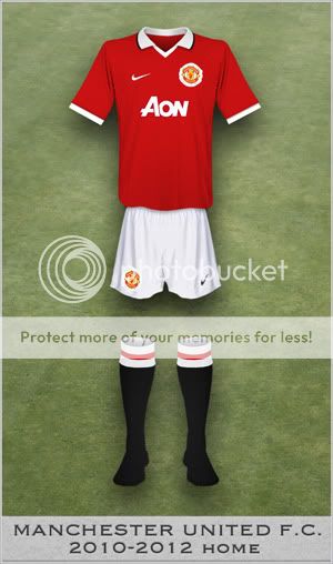
That's the first worth buying United kit since the 06/07 one
I remember that not everyone liked that kit when it was released in 2006, but now it's totally different and everyone would like to see something similar. And that's understood. Our best kit since 'The Treble' one I think.Too bad, that kit was only for one year.
That kit wasn't bad, but it was after that great 06/07 kit. I liked it, but I really found that stripe annoying.I must be the only one but I like the simplicity of the 07/09 shirt. Speed stripes on the back
Yes, unfortunately it's the same shirt, just photoshopped.It's the Score Draw retro 1977 FA Cup final kit badly photoshopped:
https://www.scoredraw.com/images/shirts/Manchester-United/product/Man Utd-77H-FACF.jpg
Can't find a bigger version at the moment, but you can tell it is the same shirt.

