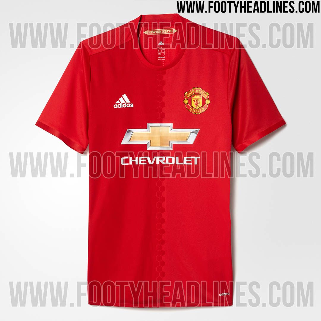
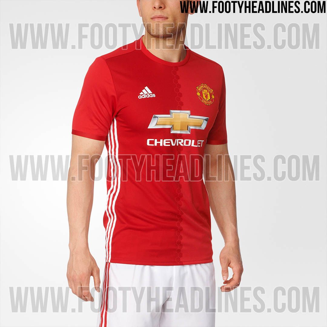
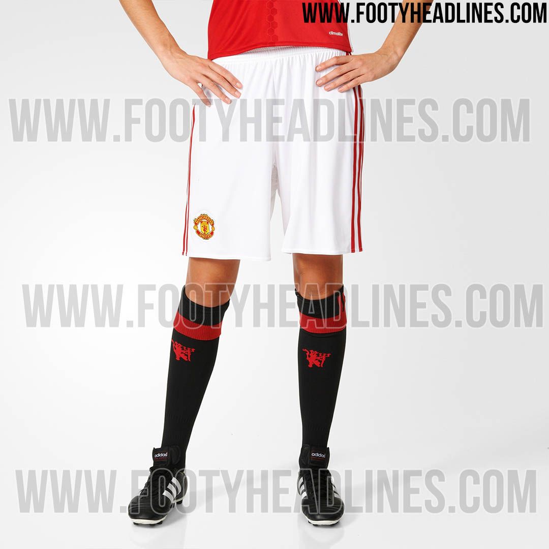
Manchester United kits 2016/17

Carl

has permanently erect nipples
Joined
Mar 6, 2008
Messages
45,419
On second thought that middle bit looks naff. Would be much better having just a bold black line or something
That's a terrible idea.

Can you imagine this place if our kit have a black stripe down the middle of it??
 

Dr Fink

Full Member
Joined
Jan 8, 2014
Messages
606
Location
Purgatory
The red kit looks superb. It's the season's look from Adidas: the stripes down the side of the body. I've just got a few t-shirts from them recently. I like the white one too - it's different. The blue third one is horrible, looks almost denim from a distance. Each to their own opinion.
 

Carl

has permanently erect nipples
Joined
Mar 6, 2008
Messages
45,419
Should have black/red/white stripes down the middle and the adidas stripes on the shoulder
We should bring back having an image of the stadium printed all over it.
 

Lennon7

nipple flasher and door destroyer
Joined
May 8, 2013
Messages
10,480
Location
M5
That's a terrible idea.

Can you imagine this place if our kit have a black stripe down the middle of it??
Can you imagine this fecking place if we had a honeycomb set of bollocks down it?
 

77

urinates in helmets
Joined
Aug 10, 2000
Messages
19,131
Location
Special once
Supports
Berwick Rangers
Kit manufacturers change things just so they can change them back again.
 

ChrisNelson

Full Member
Joined
Feb 9, 2009
Messages
3,516
I like the blue one but the home shirt is a bit bland for my liking. Sadly our home kit designers only seem to find their creativity every 3/4 seasons.
 

Nicklas

Full Member
Joined
Aug 23, 2014
Messages
611
I think it's a great kit, and it'll grow on the majority of the fans over the year. Exactly like the one from 08/09.
 

Hernandez - BFA

The Way to Fly
Joined
Jan 5, 2011
Messages
17,335
Our kits always gets slated but once it's on the players, it always looks a whole lot better.
 

032Devil

Full Member
Joined
Oct 26, 2004
Messages
22,146
Pity the white stripes aren't slimmer. They look better in the first post.
 

gaz1185

Full Member
Joined
Jul 31, 2006
Messages
3,467
Location
Manchester
Prefer kits with collars, a kit in the style of Bayern's new one would of done me this season:
 

matherto

ask me about our 50% off sale!
Joined
Nov 3, 2009
Messages
17,567
Location
St. Helens
I actually don't mind the honeycomb. I'd rather we didn't just have a generic shirt in a different colour.
 

Summit

"do the dead, spread your seed and get out"
Joined
Nov 10, 2011
Messages
51,054
Very nice!! Some peoples taste on here are suspect to say the least. Unless it's plane and boring you guys don't like anything.
Agree with this. For some reason people get all nostalgia where our kits are concerned. I'm loving everything adidas has done for us up to now.
 

Andy_Cole

Full Member
Joined
Apr 15, 2009
Messages
8,030
Location
Manchester
Do you think we have used the honeycomb design because of the bee being a symbol of Manchester? You know, the worker bee symbolising us in the industrial revolution?
 

CM

Full Member
Joined
Jul 24, 2014
Messages
7,417
It's growing on me a little but the honeycomb/two-tone thing still looks a bit naff.

Also, the stripes down the sides but not on the sleeves is kinda weird.
 

Scarecrow

Having a week off
Joined
Feb 6, 2012
Messages
12,305
Bit ironic that someone with such feminine legs is modeling a football kit.
 

Big Ben Foster

Correctly predicted Portugal to win Euro 2016
Joined
Mar 19, 2008
Messages
13,150
Location
BR -> MI -> TX
Supports
Also support Vasco da Gama
Looks very nice - reminds me of our 07-09 home kit. Simple and classy.