Manchester United Kits 2017/18

Canagel

Full Member
Joined
May 26, 2016
Messages
13,888
We are apparently releasing next seasons third kit on the 9th of May! It's the blue and gold kit, very much looking forward to see it.

The pink away kit will be released in 18th September, while the home kit will be released in 17 July.
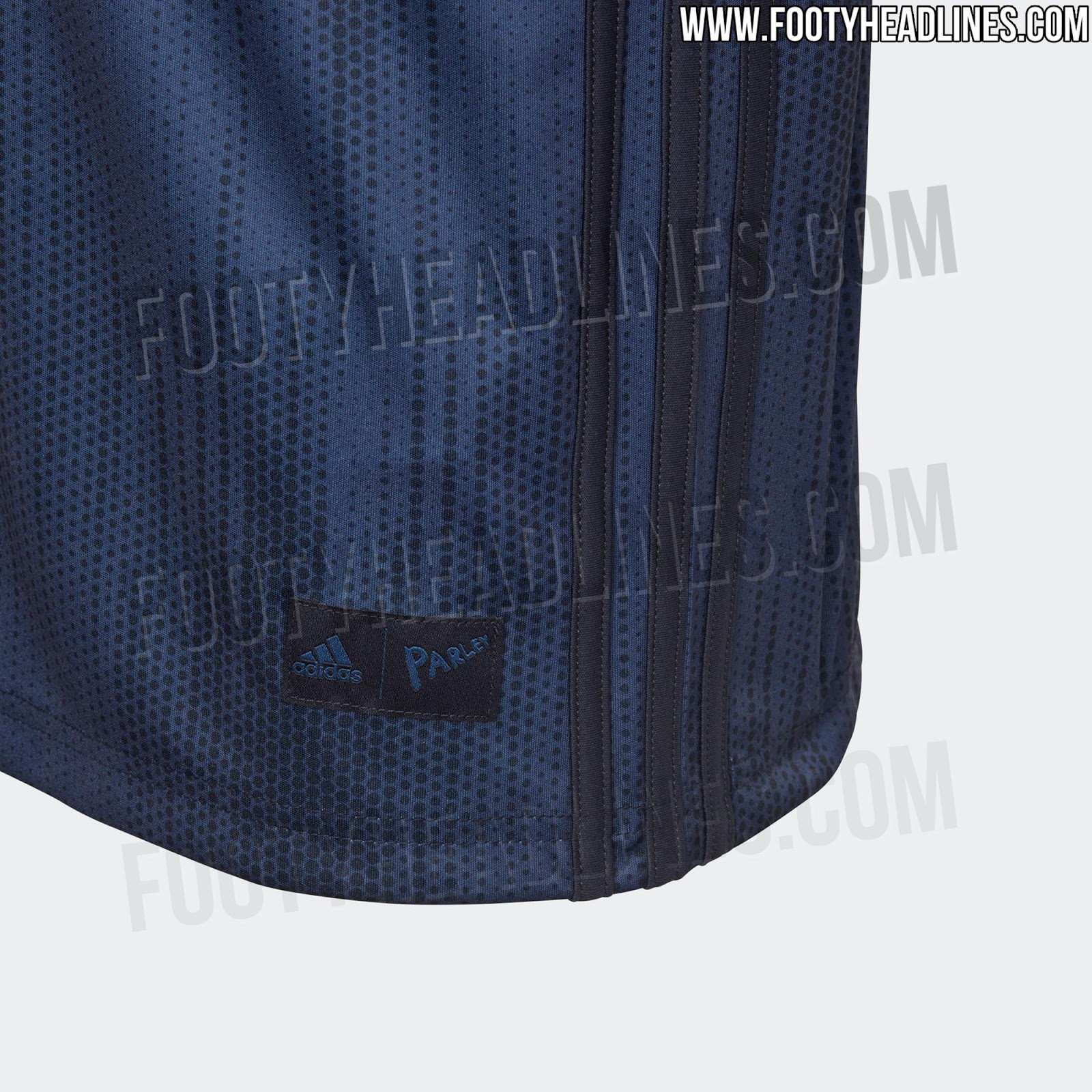
The home kit should be revealed before the end of the season so we can see it for the first time on the final day like many other teams do.
 

red thru&thru

Full Member
Joined
Mar 2, 2004
Messages
7,657
I’m pretty sure that red kit in the video is our new kit. There were those pics of Sanchez who was wearing it.

The dubious bit is Tinder on sleeve. I know there were discussions of Tinder being our sleeve sponsor earlier on in the season but don’t know what happened after that?!
 

Deleted member 101472

Guest
Love the word parley being featured and that my club cares about the planet.
 

Paxi

Dagestani MMA Boiled Egg Expert
Joined
Mar 4, 2017
Messages
27,678
Ya i'm with the fashion police here. Could have done a better job. basic feckin color coordination !!
Why not do gold lines or something?

Surely that makes sense! You've got the gold badge. The Adidas logo. The Chevrolet is gold etc.
 

jymufc20

Last Man Standing finalist 2019/20
Joined
Jan 5, 2015
Messages
3,584
Location
planet earth
Whats with the adidas parley were it usually says climacool/ adizero ?

And can anyone enlighten me on for the oceans on the inside collar ?
 

El-Manos

Full Member
Joined
Oct 8, 2011
Messages
15,004
Location
Ireland
Why not do gold lines or something?

Surely that makes sense! You've got the gold badge. The Adidas logo. The Chevrolet is gold etc.
Everyone knows navy and black is a no go. Even the farmers here in Ireland stopped making that rookie mistake.
 

Deleted member 101472

Guest
The concept Navy kit was so much nicer, I don’t think it’s a push to say 99/100 people would agree with that so why can’t adidas themselves get this right?
 

Womp

idiot
Joined
Jun 23, 2013
Messages
9,270
Location
Australia
The concept Navy kit was so much nicer, I don’t think it’s a push to say 99/100 people would agree with that so why can’t adidas themselves get this right?
Was there any difference other than gold stripes instead of black? I'd prefer gold too, but still think it looks beaut with black.
 

Summit

"do the dead, spread your seed and get out"
Joined
Nov 10, 2011
Messages
51,054
This is the third kit:


Very disappointed. Not a fan of the pattern, and expected more gold details. Instead we got three lines in blue on the sides again.
That's absolutely spot on. Love it.
 

decorativeed

Full Member
Joined
Oct 19, 2009
Messages
12,518
Location
Tameside
Great colour combo married to an incredibly basic and uninspiring design together with a pointless afterthought of a pattern. Not impressed with this one.
 

redchamp

New Member
Newbie
Joined
Jul 5, 2016
Messages
299
This is the third kit:


Very disappointed. Not a fan of the pattern, and expected more gold details. Instead we got three lines in blue on the sides again.
With you 100%. This kit had huge potential. It still kind of looks good due to the navy and gold, but nowhere near as sexy as it should be. Most of the concepts blow this away. Also this version of the shirt looks baggy as feck, needs to be slimfit to have any chance of looking decent on the players.
 

Deleted member 101472

Guest
Was there any difference other than gold stripes instead of black? I'd prefer gold too, but still think it looks beaut with black.
Gold trim on the collar and sleeves looked beautiful
 

Prodigy24

Full Member
Joined
Jun 6, 2013
Messages
3,190
Location
Malmö, Sweden
With you 100%. This kit had huge potential. It still kind of looks good due to the navy and gold, but nowhere near as sexy as it should be. Most of the concepts blow this away. Also this version of the shirt looks baggy as feck, needs to be slimfit to have any chance of looking decent on the players.
Yeah, the concepts are almost always better which always leaves you disappointed when you see the actual design. This is also the replica version hence the looser fit. The authentic version will probably look really nice on the players.
 

VeevaVee

The worst "V"
Scout
Joined
Jan 3, 2009
Messages
46,267
Location
Manchester
Wondering what everyone was going on about with the navy and black talk. Then realised I had f.lux on. The kit looked pale dark green to me. Pattern looks better in the actual blue colour anyway. At least that one has some class to it.
 

Paxi

Dagestani MMA Boiled Egg Expert
Joined
Mar 4, 2017
Messages
27,678
But there is no black on the kit. It's navy and dark blue.
From those pictures, it looks black to the naked eye. Also the colour looks like a different shade.

This had so much potential imo!
 

kr0nix

Full Member
Joined
Jan 29, 2011
Messages
1,220
This is the third kit:


Very disappointed. Not a fan of the pattern, and expected more gold details. Instead we got three lines in blue on the sides again.
The kit designers seem determined to minimise any blending of the Chevy Logo with the rest of the kit. Another missed opportunity here.
 

kr0nix

Full Member
Joined
Jan 29, 2011
Messages
1,220
Why do fan mock ups almost always look better?
Probably because fan mockups are usually designed to draw the eye away from the Chevrolet logo onto the rest of the kit, which is why it appeals to fans so much.

To be fair- that's probably more because of Chevy demands than anything else.
Yeah I agree. At this rate, I'm going to level my expectations for the pink kit.
 

SecondFig

Full Member
Joined
Feb 8, 2008
Messages
6,538
Location
▲ You Are Here
This is the third kit:

Very disappointed. Not a fan of the pattern, and expected more gold details. Instead we got three lines in blue on the sides again.
Yeah, the colour combinations are ok but I don't like the dot (bubbles?) pattern, and the mock-up (as usual) looked a lot nicer. I wasn't a huge fan of the Nike kits of the last few years but I've also been pretty disappointed by most of our adidas kits so far
 

Castia

Full Member
Joined
Jun 18, 2011
Messages
18,540
The blue one looks like a mock-up the Chevy logo isn’t accurate at all.
 

bosnian_red

Worst scout to ever exist
Joined
Aug 13, 2011
Messages
58,344
Location
Canada
Like that 3rd kit. Not as good as it could've been, but still good and the Chevy logo isnt completely dreadful with those colors.
The pink kit will be horrendous. Also not a fan of the home kit. Why so many black stripes on our home kit? They try too had to be different.
We are apparently releasing next seasons third kit on the 9th of May! It's the blue and gold kit, very much looking forward to see it.

The pink away kit will be released in 18th September, while the home kit will be released in 17 July.
Away kit released over a month into the new season?? Why so late? Cant remember when it's usually done.
 

oohaahc7

New Member
Newbie
Joined
Apr 23, 2018
Messages
7
People, all I want to know is when does the Chevy sponsorship end?

Can't wait to see that gold and chrome abomination off the United jersey.