MUFC OK
New Member
- Joined
- Oct 14, 2014
- Messages
- 7,216
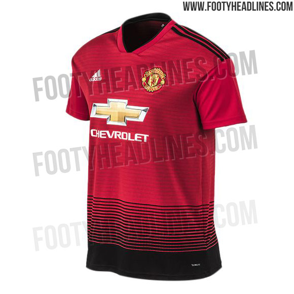
That's what I'm talking about, and half the price.Yep, it looks shite. This is the one to buy:
http://store.manutd.com/stores/manu...es=fashion,collections,1968-anniversary-range
They clearly abandoned the original colour as our new third kit is a darker blue and probably part of Adidas' Autumn 2018 colour palette.