Moby
Dick
As is pink and a bunch of other colors but we still call them as different as they are visibly different.Dark red is a shade of red?
Do you lot genuinely look at red and maroon as the same?

As is pink and a bunch of other colors but we still call them as different as they are visibly different.Dark red is a shade of red?
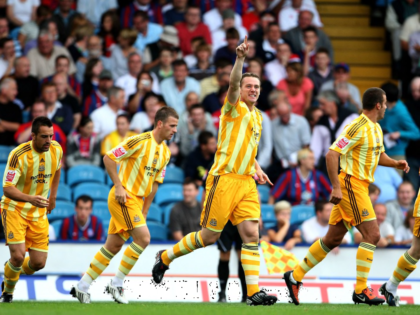
Yes, really badAnything with a lot of yellow is an eyesore (Norwich especially, the green makes it even worse).
Red and blue together looks pretty naff to me as well (especially on Palace, but even on Barca).
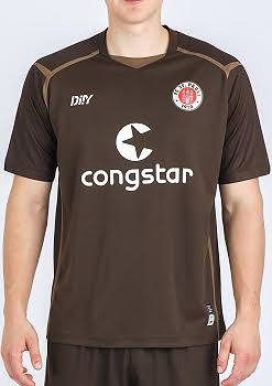
This. Always wanted to manage them on FM but their kits are hideous. Do any other clubs play in brown shirts?I love them dearly, but... St. Pauli
Nazi FCThis. Always wanted to manage them on FM but their kits are hideous. Do any other clubs play in brown shirts?
Kind of ironic for a famously left wing club to wear brown shirtsThis. Always wanted to manage them on FM but their kits are hideous. Do any other clubs play in brown shirts?
Wanted to say this! Yellow and blue, especially in stripes, always looks as if they were working for a discounter or something like this. Somehow incredibly cheap.Yellow and blue has to be the worst combination. The pics of Ronaldo in an Al Nassr kit makes me want to gouge my eyes out. Torquay United can do one as well.


Surely you mean green and goldI have quite a liking for green and yellow. Man Utd's away kits in 93, Norwich, Fortuna Sittard and Nantes. I feel like I'm the only one though. Give me some of those colours rather than the 10th red and white team in the league.
I don't like those red and white stripes with black shorts. Too many of them. Can never root for a team wearing that. These teams also have a knack for thinking those stripes mean they can get away with not wearing their away strips. See Sunderland away at Fulham in the cup this weekend. I don't want to focus that hard to watch those types of games.


Looks like a T20 shirt
Anyone who plays in brown. Especially in a farmers league where the pitch matches the shirt.
Wtf... Can't be a real kit, can it?!
Meet Spanish soccer team CD Palencia
It was part of their sponsorship with Attack on TitanWtf... Can't be a real kit, can it?!
The horror... The horror...It was part of their sponsorship with Attack on Titan
It is apparentlyWtf... Can't be a real kit, can it?!
It would be nice if teams started matching their crest with the rest of the kit. This Napoli shirt (OK the kiss ad or whatever it is, makes it bad) but the crest is also so out of place with the rest of the colors.
This shite.
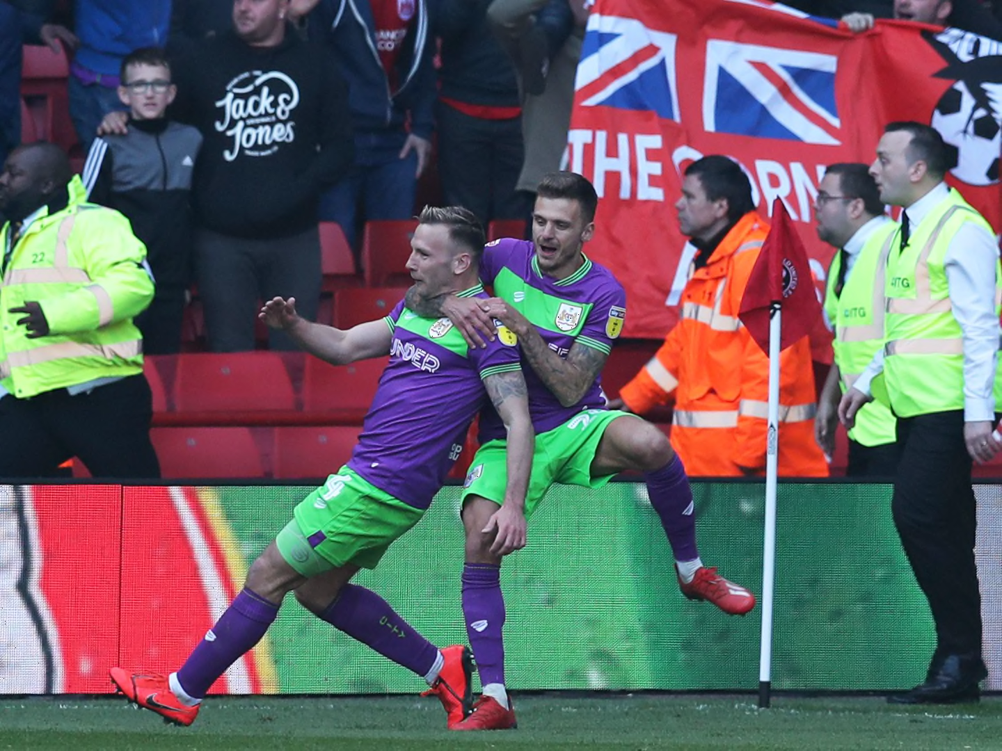
Bristol City - particularly puke worthy!

Not red then. Cool.
 what a great tagline
The winner hands down, that is embarrassingly bad.Hull City
Not a fan of green and gold eh? The foundation of our great football clubAnything with a lot of yellow is an eyesore (Norwich especially, the green makes it even worse).