astracrazy
Full Member
- Joined
- Feb 12, 2013
- Messages
- 1,460
Nah, that white kit should of had some black on it. Reminds me of a Liverpool kit way too much being just red and white.


Yup. This is class and all they need to do with the latest one is to add some black on the collar and trimmings. It'd elevate the kit imo.If the kit is white, then the trimmings/badge/text etc. all have to be black... That's just United Kits 101.
Is that when AON were the shirt sponsors? I had that with Chicharito on it...one of my favs too.Probably alone on the island that thinks that's one of - if not our best - kit for the last 20 years.
Ahhh happy days.If the kit is white, then the trimmings/badge/text etc. all have to be black... That's just United Kits 101.
The '57 FA Cup final shirt was white with red trim. The holy trinity also wore white with red trim and no black.If the kit is white, then the trimmings/badge/text etc. all have to be black... That's just United Kits 101.
Yeah, back when the trim was literally the trim (collar and end of sleeves) - which would be fine if thats what the kit looked like now, but as these days you've got all manner of shit on there, it doesn't really work without some black.The '57 FA Cup final shirt was white with red trim. The holy trinity also wore white with red trim and no black.
A Liverpool fan was never in charge of our kits.You have inside info?
Is a Liverpool fan still in charge of our kits?
A mate of mine used to work for him.A Liverpool fan was never in charge of our kits.
I met the design team a couple of times. The boss was German and the guy who led on the United side was a United fan from Manchester. I dont remember any of them being Liverpool fans.A mate of mine used to work for him.
I think the shirt looks great. If the shorts are black? All good?Nah, that white kit should of had some black on it. Reminds me of a Liverpool kit way too much being just red and white.
Yeah I thought it needed some black too. And the home shirt need more white.Yup. This is class and all they need to do with the latest one is to add some black on the collar and trimmings. It'd elevate the kit imo.
Yes you are, the gingham was hideous!Probably alone on the island that thinks that's one of - if not our best - kit for the last 20 years.

This is beautiful!If the kit is white, then the trimmings/badge/text etc. all have to be black... That's just United Kits 101.
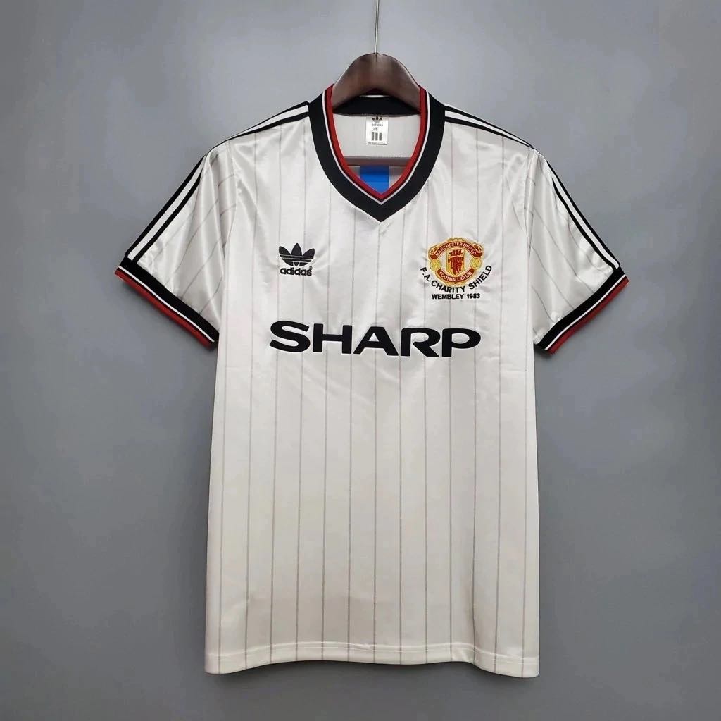
It’s really not. 2 years after the kit in your post we had this away jerseyIf the kit is white, then the trimmings/badge/text etc. all have to be black... That's just United Kits 101.
Aye, and it's naff.It’s really not. 2 years after the kit in your post we had this away jersey
Aye, and it's naff.
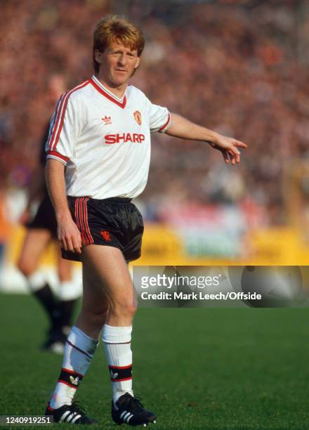
If you look historically at our white kits - the vast majority are white and black, or white black and red.
Just noticed the shorts just have the devil on itIt’s really not. 2 years after the kit in your post we had this away jersey
It's got black on it tooIt’s really not. 2 years after the kit in your post we had this away jersey
Naff is harsh to be fair, it is decent but I think 82, 84 and 88 away were all better - though you are right in that it did have the thin black lines around the red stripesed
I loved that kit. It actually had a splash of black and all.
It has red logos and sponsors which is what he was was complaining about.It's got black on it too
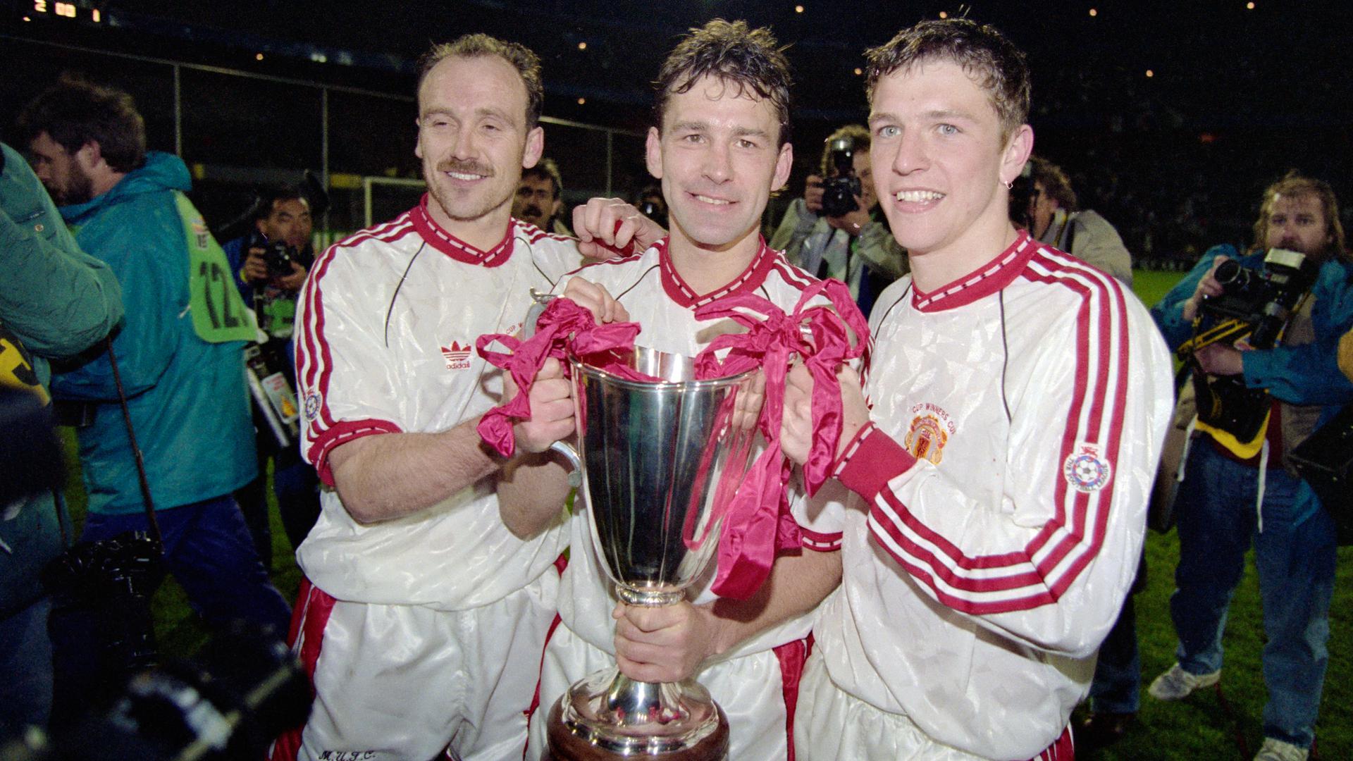
In the last 40 years, sure. Most do, but not all. I posted the one from the cup winners cup final in 91 above too. Go back to the 50’s and 60’s they were white with only red trim. Either way what you said was wrong.Aye, and it's naff.
If you look historically at our white kits - the vast majority are white and black, or white black and red.
EDIT - not naff, just not not as good as other white kits!
Surprised nobody has mentioned it actually.White kit reminds me of one of our rivals but I can't for the life of me put my finger on which team exactly.
Again 50s/60s trim was literally just collar/end of sleeves. From sponsors/manufacturers onwards, anytime we've had a white kit, bar maybe once or twice, there's been a lot of black. If we're getting super pedantic then yeah, most of the time Sharp was in red, but again there is usually black somewhere else.It has red logos and sponsors which is what he was was complaining about.
In the last 40 years, sure. Most do, but not all. I posted the one from the cup winners cup final in 91 above too. Go back to the 50’s and 60’s they were white with only red trim. Either way what you said was wrong.
It is, especially as the kits compared don't even look that close at all, the only similarity being that it's a white kit with a red accent...Weird hangup about Liverpool here. Both of our teams have Red home shirts, with a limited color palette to go with for away. We've always had similar away kits here and there over the years and if it doesn't look like one of theirs then it resembles someone else. So what as long as we keep to our colors and history of kit designs. I always remember the sponsors as being what stood out and differentiated some of the team jerseys moreso than colors of collars and little accents.
@Annihilate Now! I think picking on the color of the trim stuff is a bit off base too. Liverpool have had white kits w black trim just the same as us. I'd be more concerned if we came out monochromatic in red shirt plus red shorts or white shirt with white shorts
Guess it's changed then. He left a few years ago. My mate is a United fan but the guy running the team at the time was a Liverpool fan. Unless its my mate you met. Initials NB.I met the design team a couple of times. The boss was German and the guy who led on the United side was a United fan from Manchester. I dont remember any of them being Liverpool fans.
It’s really not. 2 years after the kit in your post we had this away jersey
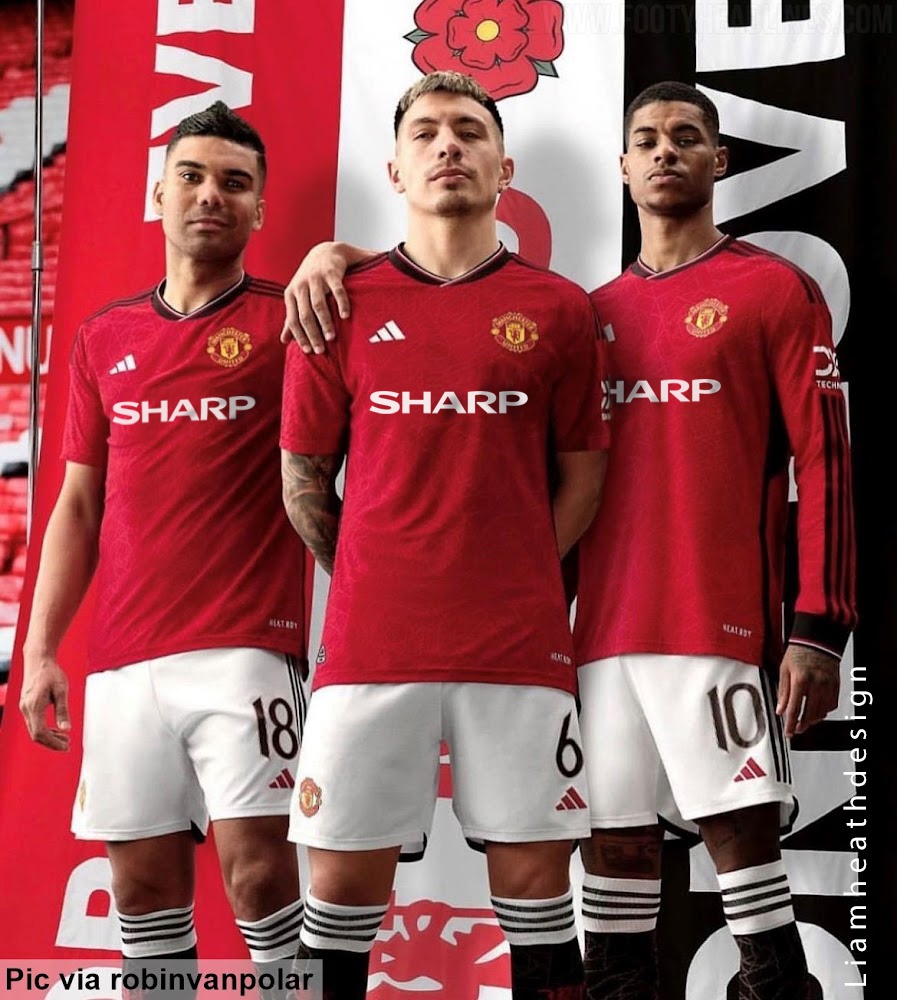
Would look much better with black shorts.Tweet
— Twitter API (@user) date
full leak a month before it’s revealed

Agree. I hate just the devil on that white shirt. It cheapens it in my opinion. We have club crest for a reason.Its the crest design that makes it resemble a Liverpool shirt, at a quick glance it looks like that bastard liver bird.
wow
A decent sponsor logo does so much for a kit
btwExactly what I was thinkingIt’s really not. 2 years after the kit in your post we had this away jersey