
2 man midfield
Last Man Standing finalist 2021/22
Can't remember the last kit i liked. 2007-09 was nice and simple, that or the one before it probably, 06/07. Nice white shield around the crest.
This!Hopefully Adidas can take over and we get something nice next year.
Always loved the Adidas stripes, so it's all subjective, hate everything Nike related. That's why I am excited as hell about this Adidas news, hope it goes through!Just look at the Chelsea/Liverpool shirts in recent years they have been no better than ours and the 3 stripes down the arms is horrible.

.jpg)


It has zero to do with how nice the kits are and everything to do with Adidas paying us £60m per year for 10 years.The away kit is pretty good to be honest
The home kit is terrible...a fusion of ours in 2011/2012 with this years little collar....
Pathetic home kit from Nike... I understand now why we'll conclude a deal with Adidas
This season? I thought the home shirt was pretty fecking good to be honest. It will be forgotten though given how shit the league has gone for us.Why oh why can't we just, for once, have a simple classic design with basic colours and no fancy tarting up.
 I always wish we would get one, but will never happen
I actually really like the look of the Home and 3rd kit (mainly because it's different). Bright luminous shit belongs somewhere there is a health and safety risk, not on a football pitch.http://www.footyheadlines.com/2013/12/exclusive-chelsea-14-15-home-and-away.html
What do people think of the new Chelsea kits? I like the yellow one but the other two look shite especially that third one.
Our home one this year is better than all of them imo and in fact our home shirt this year looks almost exactly like that yellow away shirt.
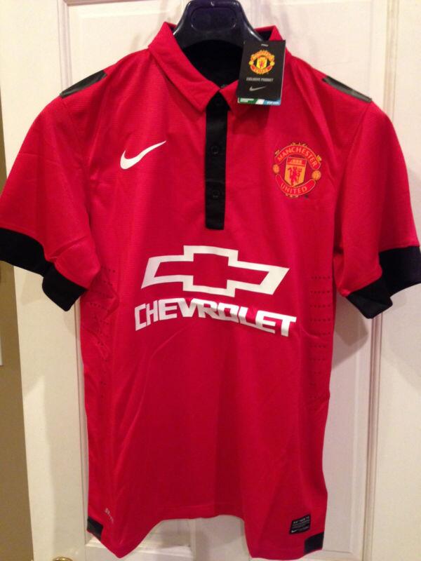
The manequin pictures look a lot more genuine. My first thought is I like the home kit more than the away kit for the first time in a few years.http://www.footyheadlines.com/2014/05/manchester-united-14-15-kits.html?m=1
Have you seen them on the mannequins on this page? The home kit looks pretty smart and also, on the Newbs someone posted a mock up of the kit and it matches it perfectly, he deserves some kudos.
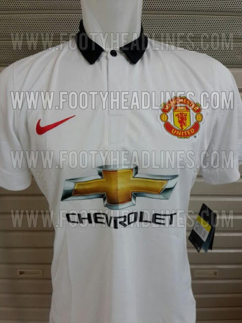
The away one is straight up hideous, the red tick looks awful and the logo looks absolutely disgusting.
This bit doesn't sound right, 2 third kits or what?The new Manchester United 2014-2015 Third Kit will be presented in August 2014, while Nike will also unveiled a blue / orange Manchester United Third Kit in September 2014.
There's no way they're fake now. I'm sure they'll look decent on the players.http://www.footyheadlines.com/2014/05/manchester-united-14-15-kits.html?m=1
Have you seen them on the mannequins on this page? The home kit looks pretty smart and also, on the Newbs someone posted a mock up of the kit and it matches it perfectly, he deserves some kudos.
The away one is straight up hideous, the red tick looks awful and the logo looks absolutely disgusting.
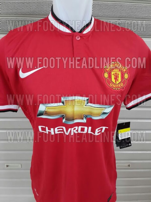

Let's not exaggerate now. They're decent kits in and of themselves (particularly the home one), but the Chevy logo is huge and clashes somewhat. Still, nothing will ever be as bad as that Liverpool away kit.They look as bad the Liverpool away white kits this season.