XdanielredX
Full Member
Yes lolYou realize those aren't the real ones, right?

Yes lolYou realize those aren't the real ones, right?
Sure, I'll have a crack at it.Wow this is brilliant, honestly makes you wonder. The simple red devil is fecking classy man any chance you could clean up the home one?
Yeh if they were going to do this it should've at least been green stripes so it could look like the matrix screen.
Look like the visualisations in Winamp or something like that.
HomeWow this is brilliant, honestly makes you wonder. The simple red devil is fecking classy man any chance you could clean up the home one?


Peole wont like the change in badge but this is bloody lovely, thanks!Home
Away
I guess they are contractually obliged to have the logo and text of fixed size and proportion.How about one without the Chevrolet text?
Surely United's commercial marketing team must check out fan opinion.
I doubt the club have a say, in comparison with say, City. City every season, whether it be Nike or Umbro have simple classy look kits. We're left with some right stinkers.Does the club have any real say in the design of the kit though? Surely all that money Nike is paying gives them the major authority on how the kit will look. It's a bit shit, isn't it?
The grandfather type collar is a bit weird, but this seasons is OK. The gingham effort was disgusting. I quite liked the one with the white stripe down the shoulder, although it looked a bit weird on long sleeved versions.You don't think this season's kit is decent?
It's not Nike's fault we're being paid more than an honest man's life earnings to have a fecking great orange mess shat on the middle of our shirt, and I'm pretty sure adidas started the whole 'one a year' thing.
That's a nice shirt, although I hope we never do the stars thing.Home
Those stars will be embarrassing if we play Real.Home
Away
Those stars will be embarrassing if we play Real.

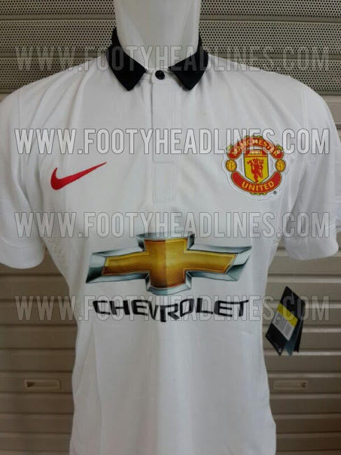
In that it's white and has a black bit at the top? Razor sharp observation there.Looks like something a waiter would wear.
Even the collar looks like a bow tieIn that it's white and has a black bit at the top? Razor sharp observation there.
You might want to take a look at this then: http://www.wikihow.com/Tie-a-Bow-TieEven the collar looks like a bow tie
To be fair, the main change that you've made here is the one that Nike have no control over, the big horrible full-colour Chevy logo. Other than that, it's basically the same kit. It's not great, but with the old AON logo it probably would have looked fine. Likewise the home shirt.Shit, here's another one I mocked up in photoshop. Crude, yes, but what I'm showing is that it doesn't take much effort to make a kit look better or more interesting. Get your shit together nike
Why is obvious. You've already noticed it far more than you would have a simple understated silhouette. The advertising industry still very much operates under the ethos that any exposure is good exposure.The home shirt is really growing on me, the away one looks horrendous. For the life of me I dont know why Chevrolet insisted on having the full Gold logo, it ruins the kit so much. The home one might have been my favourite in a long time if it wasnt for that damn gold cross!
That's classy. We should make this our CL kit for next season, but then i remember we are not in that competitionHome
Away
Since like donkeys years ago when we saw that millions of mugs around the world were readily handing over 50 notes for a gash shirt with a United badge on.Apparently we will have a third kit coming out somewhere in September. Since when do United make third kits?
Apparently we will have a third kit coming out somewhere in September. Since when do United make third kits?
We usually use the away strip from the previous season as our third kit, I imagine it'll be this seasons away shirt but with the Chevvy logo.Apparently we will have a third kit coming out somewhere in September. Since when do United make third kits?
Yep, they have done that before with AIG and Aon. Shame i'd love a proper black kit.We usually use the away strip from the previous season as our third kit, I imagine it'll be this seasons away shirt but with the Chevvy logo.
brilliant but never going to happen though. you should be working for nike design department.Home
Away
It's been 5 years since our last black away shirt, we really need another soon.Yep, they have done that before with AIG and Aon. Shame i'd love a proper black kit.