Manchester United kits 2016/17
- Thread starter bucky
- Start date
-
 In the latest episode of the United Hour Podcast, Nik @Rood and Imran @Annihilate Now! start with the good news by celebrating Manchester United Women's emphatic FA Cup win over Spurs at Wembley and the future of manager Marc Skinner.
Then it's the bad news and the ever worsening form of our Men with losses to Arsenal and Palace.
Finally the main debate - ETH Out now or keep him until the end of the season - if not longer. Are you Team Nik or Team Imran?
Deleted member 101472
Guest
Shoulders look like snakeskinThird kit, doesnt look as wow as in the other pic.Tweet
— Twitter API (@user) date
pseudo_canadian
Full Member
Would be a brilliant kit if that shit on the shoulders wasn't there.Third kit, doesnt look as wow as in the other pic.Tweet
— Twitter API (@user) date
Sammyjunn
New Member
Why do Adidas try to uncolour our badge all the time, dont like it all.I think it would look very nice without the snakeskin and a colored badge.
NinjaZombie
Punched the air when Liverpool beat City
- Joined
- Dec 7, 2011
- Messages
- 10,200
Well that looks shit.
bonusroller
Full Member
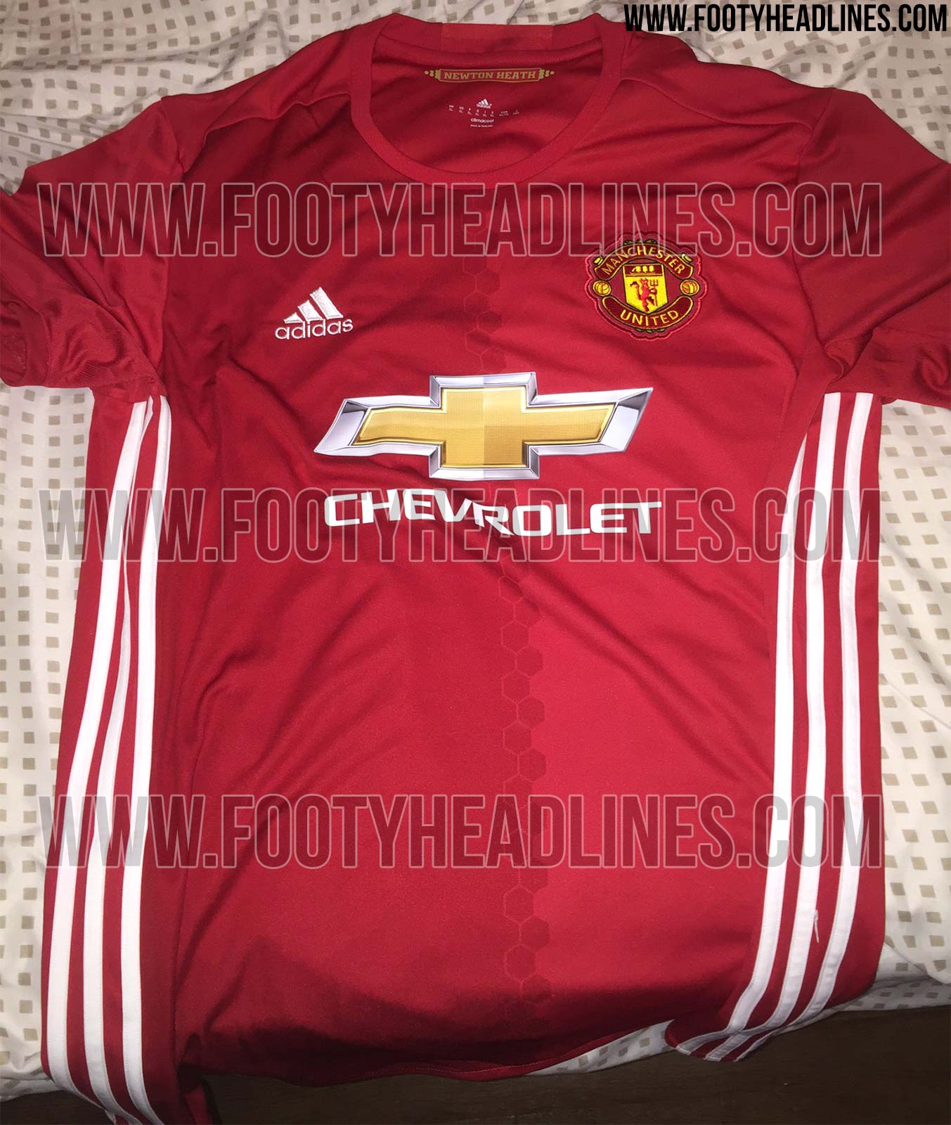
Another one of the home. It's growing on me.
Think that white third above is a far east knock off judging by the quality of it.
suheilsworld
Full Member
Love that new home kit to be honest. Will grow on you
Skills
Snitch
- Joined
- Jan 17, 2012
- Messages
- 42,155
Best set of shirts we've had since 08/09
Spoony
The People's President
Reminds me of our 1980 (?) away with black three stripes running down both sides.
Better set my washing machine to a high temperature wash thenLove that new home kit to be honest. Will grow on you
decorativeed
Full Member
I think it's more a choice of the club. Most of the marketing we put out has a monochrome crest on it now.Why do Adidas try to uncolour our badge all the time, dont like it all.
Spoony
The People's President
I dislike sow-on badges.
JoaquinJoaquin
Full Member
- Joined
- Aug 7, 2014
- Messages
- 8,609
Buy the player version then and then it will be printed on.I dislike sow-on badges.
Castia
Full Member
- Joined
- Jun 18, 2011
- Messages
- 18,484
Yeah I love the red kit, it's going to look amazing on the players. We have a good set of kits for next season, I'm impressed with what Adidas have done so far.
Spoony
The People's President
Buy the player version then and then it will be printed on.
I've not bought a United top since 1991.
Wut? So much nicer than gross printing which feels cheapo.I dislike sow-on badges.
That white shirt is fecking naff though. And I never use the word 'naff'.
Taxx
Full Member
- Joined
- Jul 16, 2013
- Messages
- 984
That white kit looks like they're trying their very hardest to make it look terrible.
That white kit looks like they're trying their very hardest to make it look terrible.
 The shoulder design is reminiscent of cheap, chavvy tracksuits.
Taxx
Full Member
- Joined
- Jul 16, 2013
- Messages
- 984
I obviously don't get design, because it would look decent with that shoulder pattern removed.
stevoc
Full Member
- Joined
- Jun 11, 2011
- Messages
- 20,878
Are potatoes a form of currency in Ireland?Nah potatoes
Spoony
The People's President
Wut? So much nicer than gross printing which feels cheapo.
That white shirt is fecking naff though. And I never use the word 'naff'.
Nah, when I were a kid some shops sold cheap knock off kits with similar sow on badges(which you actually had to stick on yourself) . That's what these remind me of.
The ones the players wear don't have sow on badges...
Truedevil
Full Member
- Joined
- Nov 25, 2013
- Messages
- 3,405
The home kit looks like a Bayern kit which is great because they're usually very good looking. It'll look ace on the players imo.
I didn't realise the players didn't have them. Sow on seems better quality to me though. I think Chevy logo would look a bit better if it was the same but might be too heavy.Nah, when I were a kid some shops sold cheap knock off kits with similar sow on badges(which you actually had to stick on yourself) . That's what these remind me of.
The ones the players wear don't have sow on badges...
I remember getting my mum to iron badges on. Can't recall if they were the sewn type or not though.
Castia
Full Member
- Joined
- Jun 18, 2011
- Messages
- 18,484
Third kit, doesnt look as wow as in the other pic.Tweet
— Twitter API (@user) date
Looks shite there but ill wait to see it in the flesh first, on paper the blue one looks terrible but after seeing it in the store a few days ago it changed my mind it's a brilliant kit.
Parry Gallister
Full Member
- Joined
- Mar 21, 2014
- Messages
- 3,121
That looks a lot better
Another one of the home. It's growing on me.
Think that white third above is a far east knock off judging by the quality of it.

Ubik
Nothing happens until something moves!
- Joined
- Jul 8, 2010
- Messages
- 19,048
at the different reactions to the third kit compared to its original leak - https://www.redcafe.net/threads/manchester-united-kits-2016-17.412323/page-3#post-19045412Third kit, doesnt look as wow as in the other pic.Tweet
— Twitter API (@user) date
That looks very early 90's ish.... and terrible.
horsechoker
The Caf's Roy Keane.
People reacted much the same way to the reveal of the home kit a few months back compared to now. You can't really judge the kits fairly until you seem them in person.
izec
Full Member
The home kit is gorgeous.
The white looks ok. Think the idea isnt bad, but not good implemented. Reminds me of my Sergio Tacchini track top
The white looks ok. Think the idea isnt bad, but not good implemented. Reminds me of my Sergio Tacchini track top
nemanja15
Full Member
I like the consistency across the kits; pattern on the home down the middle is the same as the shoulders on the away.
Wednesday at Stoke
Full Member
I like the third kit more than the home kit. That two shade color scheme always bugs me out. Why not just give us a plain red kit in one shade?
izec
Full Member
Because they do that every year? Next year it will be one coloured againI like the third kit more than the home kit. That two shade color scheme always bugs me out. Why not just give us a plain red kit in one shade?
Wednesday at Stoke
Full Member
I don't mind mixing in a different shade in a more conventional way, its the vertical two face style scheme that bugs me.Because they do that every year? Next year it will be one coloured again
That's very nice.
Another one of the home. It's growing on me.
Think that white third above is a far east knock off judging by the quality of it.
As someone else said, that white one looks like a knockoff, but probably won't be too far from the real thing. I reckon it'll look a lot nicer as a full kit.
RDCR07
Not a bad guy (Whale Killer)
Whats with the love in between the honey comb hexagons and adidas?