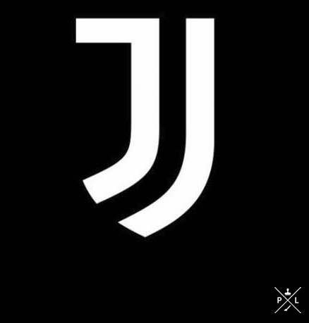
Juventus unveil bold new club crest at ceremony in Turin
- Thread starter KiD MoYeS
- Start date
-
 In the latest episode of the United Hour Podcast, Nik (@Rood) was joined by comedian Ali Woods to look back at the best and worst moments of a rollercoaster season with the annual United Hour Awards.
Has Ten Hag been sacked yet? We're not sure and we hope not, but it's looking more likely as the days pass.
Who should replace him and why is it taking so long to make a decision?


stevoc
Full Member
- Joined
- Jun 11, 2011
- Messages
- 21,439
Are you sure looks like two j's to me?There isn't. The jay is the black middle.
Sunny Jim
Full Member
Ive been thinking about it all day. As someone said in this thread new logo is good for all sorts of merchandise with clothing being the main beneficiary.
Other that i must say its feckig terrible.
Other that i must say its feckig terrible.
Giant Midget
Aka - rooney_10119
- Joined
- Aug 2, 2008
- Messages
- 5,220
I kinda like it. As with anything new in football, everyone always complains it's shit for 6 months before coming around to it.
Sunny Jim
Full Member
Looks like a wheelchair set on fire and pushed downhill.
Summit
"do the dead, spread your seed and get out"
- Joined
- Nov 10, 2011
- Messages
- 51,054
Yeah I think so. The way Juventus is written along the top signifies the top of the J imo.Are you sure looks like two j's to me?

Prodigy24
Full Member
That logo does not look like a football logo at all! The current logo is not the best, but it's a very classic logo with a lot of history that everybody recognize around the world, and has that "italian design" that not a lot of club logos have.
This one however... It's a J. Or two J's. Or even three. That's it. Way too abstract to be considered a club logo. Let alone for a club like Juventus, in my opinion.
As a graphic designer student, I know that they have put a lot of effort on creating the logo, and probably have a lot of meaning behind it, but I just can't see it as a logo for a football club.
steferrari
Juventus Fan
I think this might have been their point!That logo does not look like a football logo at all!
They want to become like a real brand: in yesterday's event they showed many J related products: sunglasses, jewels, even skis!
Not to mention that this logo would look great on clothes.
Let's be honest: not so many people makes a daily use of clothes with football crests... they're ok as stadium apparel but not so much as a daily one.
Instead I'm sure that it won't be a problem to make a daily use of clothes that carries a clean & non-invasive logo like this.
It can be a clever way to expand Juventus brand and increase revenues as a consequence.
stevoc
Full Member
- Joined
- Jun 11, 2011
- Messages
- 21,439
Don't know mate i thought you might be right until i seen it on the shirt. With a white background it looks like two. But whatever looks awful whichever it is.Yeah I think so. The way Juventus is written along the top signifies the top of the J imo.
well to start with - the gradient is so 90s, it shouldnt exist in the 21st century, the way it is executed is just terrible, dont like the logotype either, but thats a question of detail comapring to the gradient failWhat makes the Chevy logo ugly?
Ugly on a red shirt or just ugly in general?
horsechoker
The Caf's Ezza.
I picked the wrong careerApparently Juve paid 200k to the graphical designers who made this new logo.
Tweet
— Twitter API (@user) date
KN5
Full Member
Jammy JuventusWhy are there two Js?
stevoc
Full Member
- Joined
- Jun 11, 2011
- Messages
- 21,439
Fair enough mate i can see you've put a lot of thought into it. It's always just looked like a gold cross to me. I think it's looked basically the same for like 30-40 years, for the front of a car it's fine i suppose.well to start with - the gradient is so 90s, it shouldnt exist in the 21st century, the way it is executed is just terrible, dont like the logotype either, but thats a question of detail comapring to the gradient fail
The Purist
New Member
- Joined
- Jan 23, 2014
- Messages
- 1,323
- Supports
- Arsenal
No wonder Allegri wants out.
Flames73
Full Member
I'm starting to come to like it.
It is 2 J's but its also 1 J (the J in the middle bordered by Juventus at the top and the two J's at the side)
It also have a resemblance to that horse in the old badge.
It still incorporates Black and White stripe, Juventus, and that horse. It is actually quite smart. It ain't bad alright.
It is 2 J's but its also 1 J (the J in the middle bordered by Juventus at the top and the two J's at the side)
It also have a resemblance to that horse in the old badge.
It still incorporates Black and White stripe, Juventus, and that horse. It is actually quite smart. It ain't bad alright.
dann496
Full Member
It ain't bad for a t'shirt brand I suppose but compared to their last club crest it is really lacking a lot.
Can't really understand why changed a good logo for this but anyway I am sure it will be accepted after awhile.
Can't really understand why changed a good logo for this but anyway I am sure it will be accepted after awhile.
Yagami
Good post resistant
- Joined
- Jan 27, 2013
- Messages
- 13,743
If that wasn't the City badge you grew up seeing I can understand why you wouldn't like it compared to their earlier ones and current one, but I thought it was a cool badge. Still do.City's was an abomination, it's just that it was the one you were used to. I grew up with City having a circular badge very similar to their new one, so it's easy to accept.
Yeah, I just see two J's. I must be dense!It's more than that.
The Js form the shape of a more traditional crest, it incorporates black and white stripes and as someone else pointed out it could also reflect an abstract version of the horse or whatever from their old badge. There are plenty of subtle creative pieces to the logo. Plenty of thought went into it, even if it does look simple at first glance.
compared to the iconic 'current' badge? it's shit.I'm starting to come to like it.
It is 2 J's but its also 1 J (the J in the middle bordered by Juventus at the top and the two J's at the side)
It also have a resemblance to that horse in the old badge.
It still incorporates Black and White stripe, Juventus, and that horse. It is actually quite smart. It ain't bad alright.
GE
Negative Moaning Mentalist
Why change such an iconic badge to this monstrosity?
JustFootballFan
Thinks Balotelli & Pogba look the same
- Joined
- Jan 16, 2013
- Messages
- 4,245
- Supports
- Liverpool
Yeah. Next somebody will say one is also a reverse L(eonardo) and if you look closely you can see the Mona Lisa smile.If that wasn't the City badge you grew up seeing I can understand why you wouldn't like it compared to their earlier ones and current one, but I thought it was a cool badge. Still do.
Yeah, I just see two J's. I must be dense!
Ekkie Thump
Full Member
- Joined
- Mar 9, 2013
- Messages
- 3,901
- Supports
- Leeds United
my admittedly poor italian has it as "bianconero e piu"
Bianco e nero e altro/piùmy admittedly poor italian has it as "bianconero e piu"
Regulus Arcturus Black
Full Member
I expect they are probably cutting edge with this and more will follow.
Ekkie Thump
Full Member
- Joined
- Mar 9, 2013
- Messages
- 3,901
- Supports
- Leeds United
Cheers. Thought they might drop the first 'e' as it's Juventus.Bianco e nero e altro/più
Dans
Correctly predicted Portugal to win Euro 2016
It's one J in the black and white stripes.Yeah I think so. The way Juventus is written along the top signifies the top of the J imo.
Because it's an iconic football badge, but the club want to expand the reach of the brand beyond football fanatics to casual fans and even people who are not interested in football. It's a bold approach and interesting experiment that I am sure a lot of Clubs will monitor closely.Why change such an iconic badge to this monstrosity?
Ixion
Full Member
- Joined
- Apr 11, 2003
- Messages
- 15,275
I don't have much to say on the badge other than the original was nice but this thread did result in me going to youtube and watching highlights of a bunch of our matches against Juve. Good times.
I used to draw this on everything when i was a kid. Love it.Found it...
decorativeed
Full Member
It's not that I didn't like City's previous badge, it was that it was a joke and their own fans (the few that they had at that time) hated it too. It featured three 'purely decorative' stars, a made up on the spot (and frequently incorrectly spelled) latin motto that had no prior history with the club, and an eagle whose only previous appearance on a football shirt was on United's in the 1958 FA Cup final. It was a hodge-podge of terrible ideas.If that wasn't the City badge you grew up seeing I can understand why you wouldn't like it compared to their earlier ones and current one, but I thought it was a cool badge. Still do.
Yeah, I just see two J's. I must be dense!
cyberman
Full Member
- Joined
- May 26, 2010
- Messages
- 37,331
It's a badge. A badge.Because it's an iconic football badge, but the club want to expand the reach of the brand beyond football fanatics to casual fans and even people who are not interested in football. It's a bold approach and interesting experiment that I am sure a lot of Clubs will monitor closely.
And it will be replaced by a brand logo. A brand logo.It's a badge. A badge.