Hammerfell
Full Member
- Joined
- Apr 26, 2015
- Messages
- 7,778
I think it'll look better when worn by the players, just looks awful hung up or (probably) on your average fan.

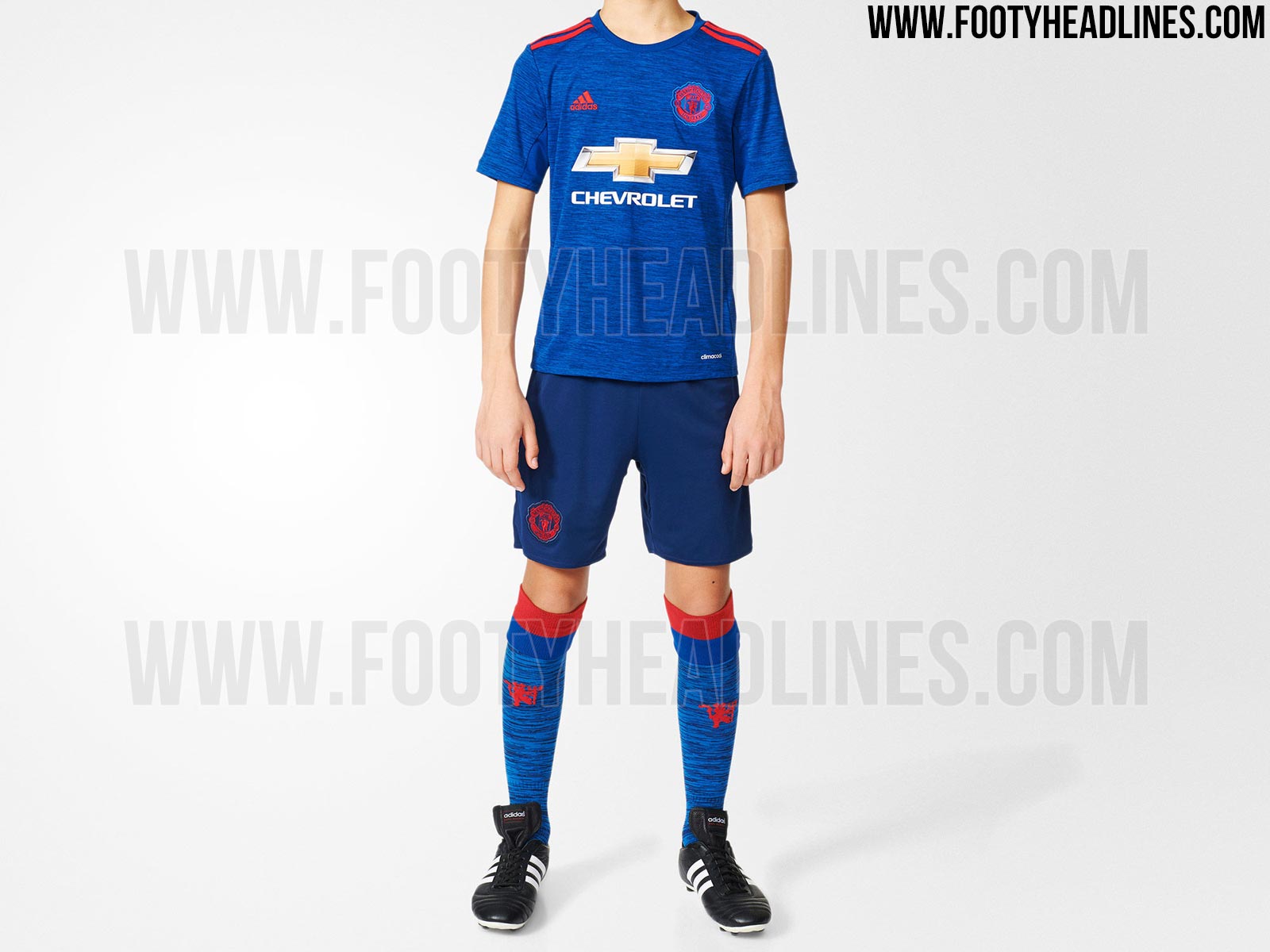
That blue kit couldn't look more fake if you tried.

")
The designers were probably told ''they are giving us no value for our money anyways, so make the design dull, like the football''.A shit kit for shit on a stick football
Until 2021, it'll be because of the huge Chevrolet logo not fitting the colour scheme of the rest of the kit.The blue one isn't the worst.
At the risk of repeating myself, why can't we have classy kits? Is it the badge? The colours? The idiots designing them? The idiots at the club telling the idiots designing them what to do?
I guess it goes well with our sleep inducing football thenThe full kit looks like fecking pyjamas
Chevrolet. Fecking Chevrolet. Our home and away would've been the most beautiful in years if not for them.The blue one isn't the worst.
At the risk of repeating myself, why can't we have classy kits? Is it the badge? The colours? The idiots designing them? The idiots at the club telling the idiots designing them what to do?
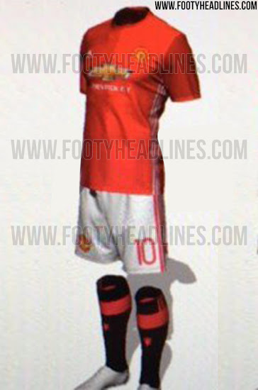
DubiousTerrible picture, but this is supposed to the full home kit:
Nope but Fellaini cost £28 million and is lanky with stupid hair.has LVG taken credit for these kits yet?
And likes masochistic sex apparently..Nope but Fellaini cost £28 million and is lanky with stupid hair.
Dubious
The numbers are on the rear of the shorts and the supplier logo on the front, is it not so?
The numbers are always on the front, no? With Nike, the logo was underneath the numbers on the front, while with Adidas I believe the number's still on the front with the logo on the back?And likes masochistic sex apparently..
what an imageUntil 2021, it'll be because of the huge Chevrolet logo not fitting the colour scheme of the rest of the kit.
The Chevy logo is bad but there's still something not quite right every time.Chevrolet. Fecking Chevrolet. Our home and away would've been the most beautiful in years if not for them.
Stylishly challenged is first thing that comes to mind! Design, color, style...all looks like a cheap knockoff.
To be fair, not half as disappointed as Adidas are, I'd say!Not even a year into the adidas deal and we're already disappointed.
On the front for European games I think. That pic looks like the style we have used in Europe.
Heard LVG had the final say on the kit...if Woody can't sack him for the atrocious football them the dire blue top should hopefully convince him!That looks like crap. Who ever Ok'd it should be sacked.
I quite liked those, they were softer and more breathable than the usual jersey fabric.It looks like a shite pyjamas. Adidas made Madrid a grey version couple of years ago and it was horrendus
Maybe your right ><
I'd use it as my favorite nightpyjamas for sure.That looks like crap. Who ever Ok'd it should be sacked.
Not true. We could make the entire kit gold, then it would blend in seamlessly.Same as the last few. I won't be buying any because the gold chevrolet logo is hideous. The only way it would work is if we make the white stripes the same colour of gold.
 " -> Actual shirt pictures released 95% go "oh noes! Embarrassing" 5% "It'll look better when it's on the players" -> Jan/Feb "I didn't like the shirt at first but it's really grown on me" -> "I wish we had a black shirt"
You forgot to mention the Chevrolet logo moaning, though spot on otherwiseHas there ever been a kit thread that didn't follow:
"I wish we had a black shirt" -> Ridiculous rumours "eww ugly" -> Various fan made photoshops followed by various tones of "nope" and "