If you're curious about what the modelling is actually looking like and what the appraisal was in June (that led to the opening being delayed until July) this will give you an overview:
https://www.covid-arg.com/post/modelling-the-return-of-freedoms
You need to download the pdf file to see the modelling summaries from Sage. Basically they have three models - imperial College, Warwick and LSHTM. These start with various scenarios relating to how much more infectious Delta is, what the hospitalisation rate would be (unvaccinated) and how well the vaccines are working. Then they try and describe what might happen if...
Currently cases are rising as fast as predicted in early June but hospitalisations are lower (but rising). The black/orange lines were the Warwick predictions of what would happen if we reopened fully on June 21 as planned v July 19. The blue is the actual hospitalisation data so far.
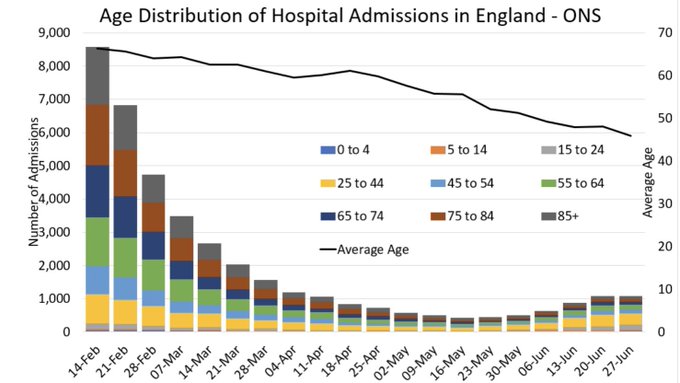
This seems to be down to the cases not really moving out of the under 29 group in the same way as they did in previous waves. That's assumed to be part vaccine and part behaviour related (the vaxxed mixing mostly with the vaxxed for example). Unfortunately it now looks like it's spreading into the very highest risk group 80+ probably from unvaxxed or single vaxxed family members or carers, hence why hospitalisations are starting to rise, having not risen as early as was expected.
Next week's data will give people an idea of how the infection is moving through age groups and the vaccinations given in June are part of the equation.
Right now it really is too close to call, but there is an assumption in all the Sage scenarios that not only will there be an exit wave, there will be a lot of hospitalisations over the next year and thousands more deaths. That's what "living with covid" means - we're just not used to seeing it as a calculation.