A gorgeous naked woman could not make this hot..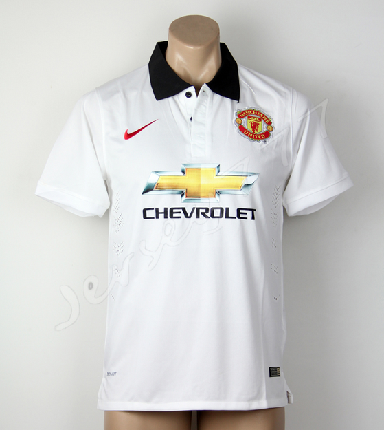
Another picture of our supposed kit.
From a line of many bad ones from Nike this one sinks it..
Bring on Warrior at least they pay.
A gorgeous naked woman could not make this hot..
Another picture of our supposed kit.
Don't spout such rubbish!One of these days we'll buy a good midfielder and have a decent kit.
That kit even with the gold logo would look pretty good. The kit leaks with the gold logo are just horrible.Basically this is what we should have done with the logo as it looks loads better.
Tweet
— Twitter API (@user) date
Unfortunately Chevrolet didn't pay through their arses to not get the exact colours and design they want so we just have to get used to it. It's a shame though cos I think that image shows it could look pretty decent without the gold colouring.
Cheers fellas.No idea man. There used to be a cracking shop on ebay about 3 years ago but its gone now. They only sold originals rather than their replicas. Wish id more money back then!
Theres a white addidas away jersey from the early 80s thats easily the nicest jersey Ive ever seen.
Problem is ive never even spotted a replica of it...
You can't just change a brand's color or its logo, it's part of the company's identity.


I heard that was part of Bale's transfer negotiations.I don't know why ye babies are crying about your jerseys, they are not that bad. We have to defend la decima next year wearing pink.
Probably. I doubt Ronaldo is complaining eitherI heard that was part of Bale's transfer negotiations.
Did you see Liverpools away kit from the past two seasons?A gorgeous naked woman could not make this hot..
From a line of many bad ones from Nike this one sinks it..
Bring on Warrior at least they pay.
damn that's really a nice one.Basically this is what we should have done with the logo as it looks loads better.
Tweet
— Twitter API (@user) date
Unfortunately Chevrolet didn't pay through their arses to not get the exact colours and design they want so we just have to get used to it. It's a shame though cos I think that image shows it could look pretty decent without the gold colouring.
Yeb they looked terrible, but does this..Did you see Liverpools away kit from the past two seasons?
Sponsor aside it's a fine kit.Yeb they looked terrible, but does this..
I really hope you're right but all these logos were used in previous years and are not used nowadays. This yellow/gold logo is the brand's official logo since 2011( it's been gold since 1982) and i don't think they'll "negotiate" any chances. We are fans and we can moan as much as we want about how bad the shirt is going to look like but for them this is a very important/aggressive marketing move in their efforts to increase sales in England and the rest of Europe.


From a quick Google search. All official Chevrolet logos that don't have the gaudy gold and could be incorporated into a team kit with red, white and black as their dominant colours.
Sharp, Vodadone and AON were all predominantly red on white, and we flipped the colours to suit. AIG were predominantly white and blue, but we made it fit. We could have easily done the same with Chevrolet and included the bow without the disgusting gold shite in it.

I cant agree with you on that...Sponsor aside it's a fine kit.
Is it just me or does the manikin look nude?
Im putting it off! this is my personal favCheers fellas.
£160! I'll take the plunge eventually no doubt.

Like people, many mannequins are nude under their clothesIs it just me or does the manikin look nude?
I'm sure the Chevy symbol is photoshopped. So I'm still not convinced we'll have that design.A gorgeous naked woman could not make this hot..
From a line of many bad ones from Nike this one sinks it..
Bring on Warrior at least they pay.
Not really. It's wearing some god awful t-shirt.Is it just me or does the manikin look nude?
first thought was that the mannequin was inspired by ronaldoIs it just me or does the manikin look nude?

Not likely, they're reportedly pulling out of all European markets by the end of 2015.I really hope you're right but all these logos were used in previous years and are not used nowadays. This yellow/gold logo is the brand's official logo since 2011( it's been gold since 1982) and i don't think they'll "negotiate" any chances. We are fans and we can moan as much as we want about how bad the shirt is going to look like but for them this is a very important/aggressive marketing move in their efforts to increase sales in England and the rest of Europe.
As for Sharp, Vodafone and AON the truth is that the white logos on the red shirt were the best way to keep the brand's logo easily identified. The AIG logo is blue and it was changed to white so that the logo would remain distinguishable on a red shirt, especially for those watching on TV. This doesn't seem to be the case with Chevrolet and if they say there's no need for any changes i don't believe we'll have a say in this one. You see Chevrolet are paying to be advertised, we are the ones who get that money...
The club sponsors have been playing matches at OT for the last couple of weeks. That's a photo of 'Team Chevrolet' after their game and the shirt they are wearing is just one they've had made up for the occasion.At Old Trafford, that's Robson and Cole. That is our new kit.
that's one very good looking kit.Basically this is what we should have done with the logo as it looks loads better.
Tweet
— Twitter API (@user) date
Unfortunately Chevrolet didn't pay through their arses to not get the exact colours and design they want so we just have to get used to it. It's a shame though cos I think that image shows it could look pretty decent without the gold colouring.
Annoying isn't it? It's just like they put in no effort at all for our designs. I liked this seasons home shirt but it does appear next seasons home and away shirts are going to be pretty rubbish with the eyesore Chevy logo.Roma's kit is just pure sex. If Nike can do that why can they do it for us this season??
Had to check this myself, indeed, Romas Nike kit is pure sex.Roma's kit is just pure sex. If Nike can do that why can they do it for us this season??

Like feck we should. Nothing wrong with our red. It's just a nicer kit.I think Roma's kits appear nicer because of their colours. It's a more classy shade. We should use a darker shade of red.