
- Joined
- Jun 13, 1999
- Messages
- 24,612
What do you mean? It looks ace!!The Online icon under your username doesn’t look right.
What do you mean? It looks ace!!The Online icon under your username doesn’t look right.
The alignment, see under my username.What do you mean? It looks ace!!

I'm kiddingThe alignment, see under my username.
") I'm gonna fix it soon.
I'm gonna fix it soon.Is there anything like it that works on android? I can't seem to find one online anywhere.You might want to switch to another one like Stylus, I found out about this last night - https://robertheaton.com/2018/07/02/stylish-browser-extension-steals-your-internet-history/
Yeah I agree tbh. It kinda makes me think of vBulletin 3 now.Personally I preferred how the sidebar headers and quotes looked before as they now look like something from years ago (dated) but think the caf in general will probably prefer them how they are now due to them basically being like on Xenforo 1 and the vBulletin days.
Also preferred the alternating row colours as well as the old row highlight (wee yellow doesn't fit at all).Yeah I agree tbh. It kinda makes me think of vBulletin 3 now.
Yeah it was nice and added a bit of contrast when looking down the page rather than solid white.Also preferred the alternating row colours as well as the old row highlight (wee yellow doesn't fit at all).
I can't remember either if it was there but I've just added it to convos.I can't remember if you could see who was online in conversations, but in case you could, moving the online symbol to the red bar thing means it doesn't show up in conversations as there isn't one there. If you couldn't see who was online in conversations then ignore the previous.
ThanksI can't remember either if it was there but I've just added it to convos.
I don't know if it's just me but it's showing that you've received 711 likes for that postWhat do you mean? It looks ace!!

Just means the user @711. Might be clearer with text after it saying "has/have liked this post"I don't know if it's just me but it's showing that you've received 711 likes for that post
It just means @711 liked it you pillow.I don't know if it's just me but it's showing that you've received 711 likes for that post
But then you'd probably still think it meant that 711 people have liked the postJust means the user @711. Might be clearer with text after it saying "has/have liked this post"

Obviously giving 711 a name change is the only option.But then you'd probably still think it meant that 711 people have liked the post
Only scouts, mods and admins can due to us using likes for promoting new users.Can’t see how to like a post.
Red background is due to something not loading so the error page is loading in the background. Don't know what it is but I imagine it'll be gone when Niall is aware of it. I'm sure it isn't intentional anyway.Is there anyway to remove the red background of the match day threads ? Looks atrocious on PC, I just noticed.
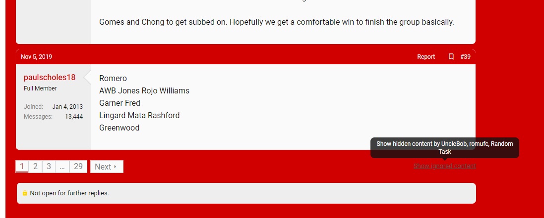
The button to show ignored contents for example is barely visible here thanks to it.
I also noticed that I can't copy images directly, need to copy the link and add it manually, is this a technical problem ?
Thanks! Hopefully it'll be fixed soon.Red background is due to something not loading so the error page is loading in the background. Don't know what it is but I imagine it'll be gone when Niall is aware of it. I'm sure it isn't intentional anyway.
I don't know if it's just me but it's showing that you've received 711 likes for that post
I deserve 711 likes for that witty retort.Urgh, threadmarks look awful. I need to address that. The pie looks nice thoughThanks Niall. Also a slight thing, for Threadmarks there's a red border to the left and right which looks out of place. You can see an example on this link
There's lots more to do but getting there. This was all expected. A major update always produces a crazy number of snags. Plus you lot are a picky and pedantic bunchWow great job! Hopefully we're not a big burden on you with all these requests.
