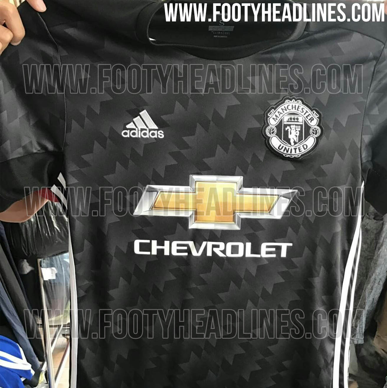
God forbid people would voice any sort of displeasure over the issue of commercialization, am I right? I mean it's just weird that club supporters would rather the club crest feature in its intended colors than a foreign sponsor. But money and Deloitte rankings and revenues and flashy signings right? There's been very little success around here since that has been the business model.
I don't necessarily disagree with that but for this particular discussion that argument had more merit in 2014. People seem to have no problem with the idea of United selling the advertising space on the shirt, they just don't like which company logo is placed there. I mean come on it's literally the same thing being discussed over and over again 3 years on.
Someone says they hate the Chevy logo and how horrible it is, another person says but thats their company logo they use on all their recent cars and they pay a lot of money to put it there, then someone else says but why can't it just be white text or text and a white outline... bla, bla, bla rinse repeat.
I had thought that at some point over a 3 year period people would just make peace with the fact that the logo is here to stay. It seems i was wrong.
 ).
).

")